El Almacén
May 20, 2011 | 2 Comments
Designed by Atolón de Mororoa | Country: Uruguay
“El Almacén is a restaurant located in Manantiales, Punta del Este, one of the major tourist spots in Uruguay. El Almacén is devoted to preparing tasty artisan food. We worked on the restaurant identity, including the design for their take away bags. The design represents slightly more stylized graphics that are commonly used in typical stores and fairs in Uruguay.”
Student Work – Daniel Rodriguez
May 19, 2011 | 12 Comments
Designed by Daniel Rodriguez | Country: United States
Student Work – Joy Lin
May 19, 2011 | 1 Comment
Designed by Joy Lin | Country: United States
“The reusable X-ACTO packaging recognizes the user’s every need in terms of transport, storage, usage, and disposal. Additionally, the compartmentalized design ensures that all of your precision tools are safely and conveniently accessible.
Packaging looks as if it could have actually been cut out with an X-ACTO blade. The material is stacked B-fluted corrugated, die cut and printed using soy-based flexographic inks. The packaging is meant to be portable and reusable.”
7 Plagies
May 19, 2011 | 2 Comments
Designed by Redfish | Country: Greece
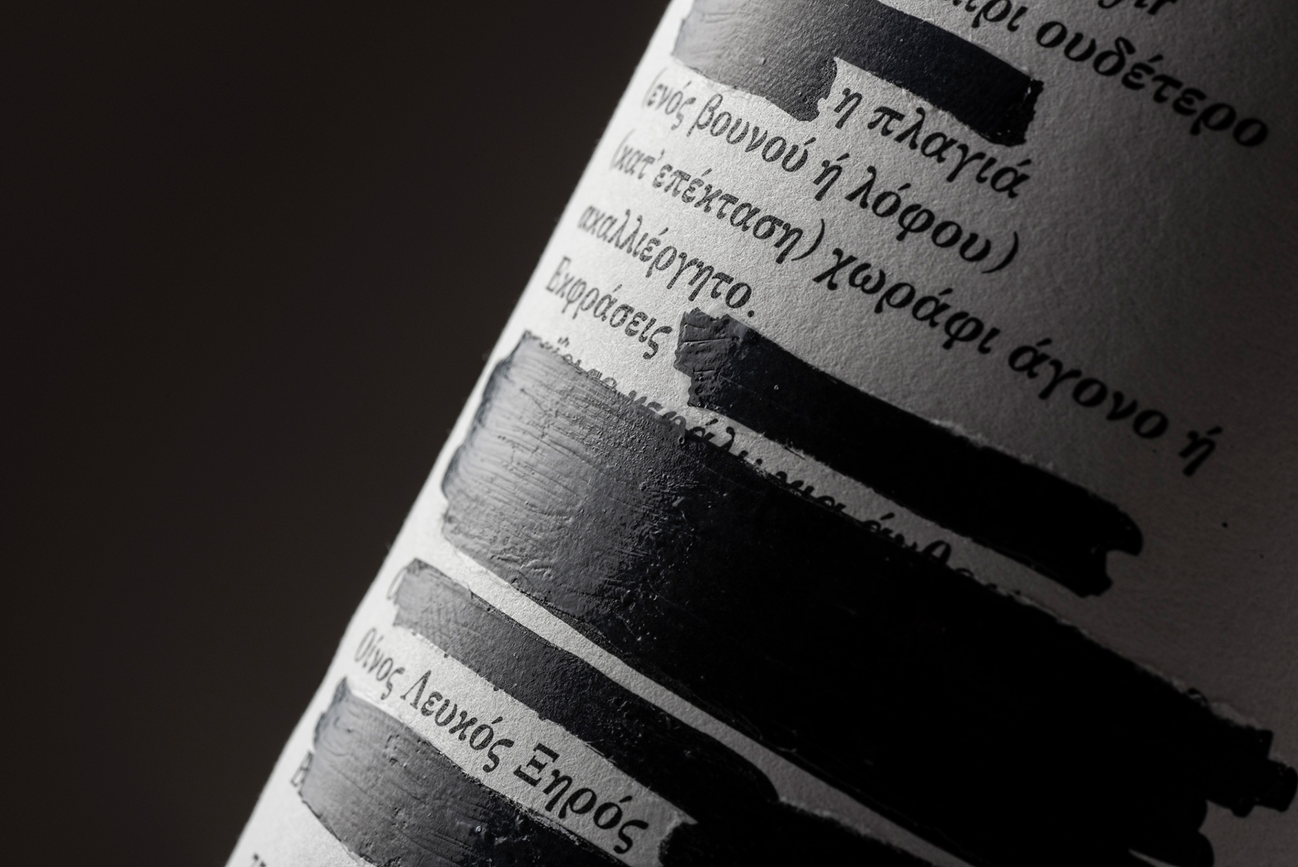
“We designed this new wine family, for Photos Photiades Winery in Cyprus. Named 7 plagies (7 hill sides) after the 7 hill sides that exist in the territories, and the number 7 that according to the Pythagoreans is the perfect number because it is the sum of 3 and 4 (triangle and square)”
Student Work – Madeleine Skjelland Eriksen
May 19, 2011 | 1 Comment
Designed by Madeleine Skjelland Eriksen | Country: Norway
“A package design assignment to make a package for the perfume Ègoiste by Chanel.
The package was to be informative, available and appealing to blind (with braille text), visually impaired and people with regular eye sight.
The package is made out of steal to underline the masculinity and sophistication. The design itself is meant to be clean, and the braille text, along with being inclusive to blind, works as a decorative element in the design.”
Finca Cucó
May 18, 2011 | 2 Comments
Designed by Atipus | Country: Spain
“The “cucó” is an architectural piece typical of the Priorat region. It is a stone cottage with a small entrance (in the form of an “o”), located on the cultivated land. This cottage was used as a refuge in bad weather, and also as a place to rest when the farmer have to travel between their lands.
The graphic of the wine was born as a synthesis of the “cucó” looking for a strong and attractive image, for a wine that goes to a public who love´s wine. They seek for a good value for money, but also an exclusive design for the bottle.”
The White Company
May 18, 2011 | 3 Comments
Designed by Aloof | Country: United Kingdom
“Branding and packaging design by Aloof for a new range of products for The White Company.
The ‘herbal range’ represents their most confident collection to date. Graphics, colours and print processes have been reduced to a minimum, with debossed-effect graphics forming part of the ceramic moulding of the products.”
Westerham Brewery
May 18, 2011 | 1 Comment
Designed by D. Studio | Country: United Kingdom
“The Westerham Brewery is one of Kent’s finest craft brewers, producing exceptional real ales from locally sourced ingredients.
In partnership with their German friend and master brewer Markus Lotz, the Westerham Brewery brought together the best of each country’s brewing processes to create a range of German style beers.
D. Studio came up with the strapline ‘German beer, Kent accent’ to reflect the coming together of the two great brewing nations. This idea was reflected in the label design with the top half featuring hand crafted German blackletter script and border styling whilst the bottom half was a more English affair.
D. Studio also created the names for the beers, which further expressed the idea and communicated the style of each beer with an anglo-German play on words.”
Jam Jar Sweet Shiraz
May 18, 2011 | No Comments
Designed by Cape Classics | Country: United States
“A retro-inspired red and white pattern, which replaced Jam Jar’s original checkered gingham on the capsule and carton. A change was called-for after the original design came under trademark infringement claims by a large food products corporation. An initiative was drawn to create a new, distinctive and lively design, that stayed true to Jam Jar’s messaging as “Sweet Perfect… Simple, Pure and Honest.”
Philab
May 17, 2011 | 2 Comments
Designed by Chris Trivizas | Country: Greece
“Philab is a Greek cosmetic production company. Its philosophy is based on the principles of efficacy, quality and safety.
Given the company’s name, the source of inspiration for its logo was the Greek letter ‘Φ’ [Phi] which stands for the divine proportions, the ‘golden ratio’ 1.618, named after the sculptor Phidias. The absolutely symmetrical shape of the capital ‘Φ’ was moulded in such a manner so as to resemble the shape of a round bottom test tube of a chemical lab. The deep purple reconciles the power of red with the power of blue.