Designed by Jenny Pan | Country: United States Jenny Pan is currently a graduate MFA graphic design student at Academy of Art University. There’s no doubt
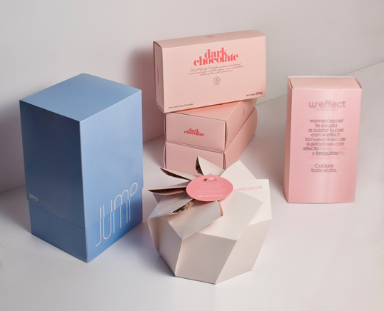
Designed by Base | Country: Spain “Every season Women’secret sends out press gifts. Creative pieces which contain the seasons key garments which continue to surprise the
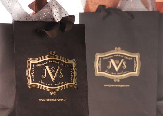
Designed by DBD International | Country: United States “New York City’s premier boutique for skin care to the elite, after completing the brand identity, bags were
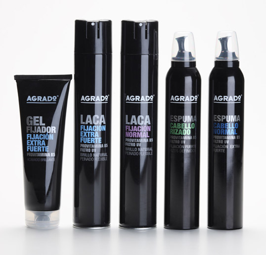
Designed by Estudio Marisa Gallén | Country: Spain “Packaging for Agrado Cosmetics hair line. Despite being targeted to mass consumers and distributed in general supermarkets, we
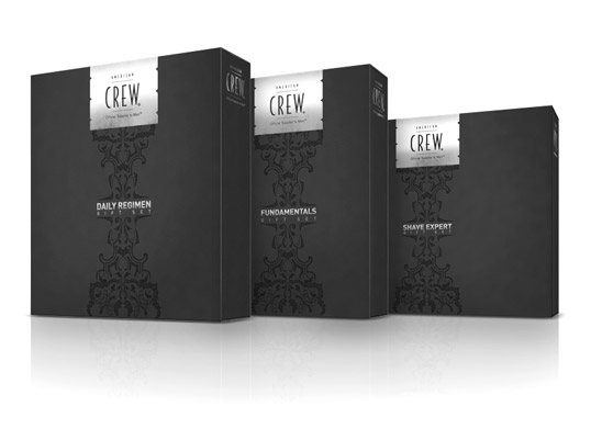
Designed by Karsh\Hagan | Country: United States “These boxes were designed for American Crew’s Holiday Gifting by Karsh\Hagan. The system includes three boxes, a bag and
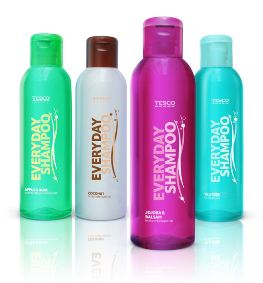
Designed by P&W | Country: United Kingdom “International Design Consultancy P&W has redesigned the packaging for Tesco’s health and beauty essentials range. The range, comprising of
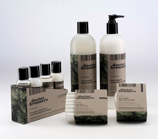
Designed by Tyler Hamilton | Country: United States “Dr Bronner’s liquid soap, lotion, bar soap, body balm, and 4 pack sampler of shampoo, conditioner, soap, and
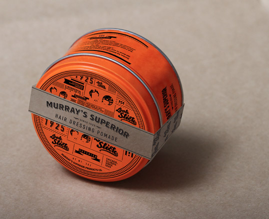
Designed by Jadyn Klassen | Country: Canada “This is a repackaging design of Murray’s Superior Hair Dressing Pomade. I decided to keep the orange tin because