Designed by eStudio Calamar | Country: Spain/Berlin
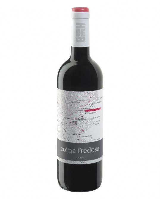
“For the design of this Coma Fredosa as well of that of other wines from the same winery, the “graphic language” of the topography is a key element that offers a series of clues and concepts about the wine and the winery to the spectator/consumer.
· The topography helps us locate geographically the estates within the municipality of Colera. The contour lines allow us to understand the distinct orography which requires the grapes to be picked by hand and deeply affects the wine.
· Sea and mountains*. From right to left across the topography on the label we can travel from estate to estate, starting at sea level to finally reach Albera mountain range.
· The GPS point locates the exact position of the winery and at the same time works as an element of interaction and information for the consumer. A simple search of the GPS coordinates puts the local information on the label in the context of the Global geography.
· Through the topography we can find the location of the estate which produced this Coma Fredosa, as well as the location of the winery’s different estates and some geographic points after which the other wines are or will be named.
· Screen printing has been used to recreate the relief of the topography and other elements as if it were topographic braille, which invites the recipient to touch the label and feel the distinct topographic relief.
· As if it were a “secret game” with the client, in the village of Colera the owners’ family home has been marked in red. The other houses and plots on the “map” are dark grey.
· The top of the wine capsule is crowned by a circle/point with different conceptual connotations: it is the GPS point that can be seen on the map, it makes reference to the winery’s logo, it is a graphic synthesis of a grape, it is… The capsules of the various wines share this same element as a conceptual link.
· The colours used on the label are a combination of corporate colours, established to maintain a chromatic consistency with the other labels and the graphic image of the winery.
In a way this wine label is the prologue that complements and strengthens the concept of all the other labels of this winery.”