Designed by Facing Ltd. | Country: Switzerland
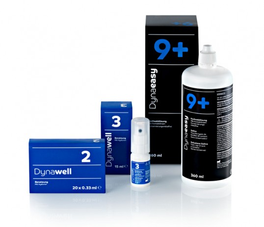
“Dynoptic is a network of opticians in Switzerland, offering a collection of contact lenses and lens care products. Dynoptic’s packaging distinguishes itself through its uniquely simple design and its black background, which clearly sets it apart from the design of its competitors. The coloured numbering system on products enables customers and opticians alike to quickly recognise the products, as every colour represents a specific purpose. A green number indicates “All-in-One” products, a red number denotes products which should be handled with care and a blue number stands for products which can be used to quickly clean contact lenses on the go. The font “CoHeadline” by Dalton Maag was chosen, as it appeals to both sexes with its use of corners and curves. The Dynawell suite of eye care products was designed using the same concept. The colour scheme for Dynawell products, however, is a blue background and white numbers.”