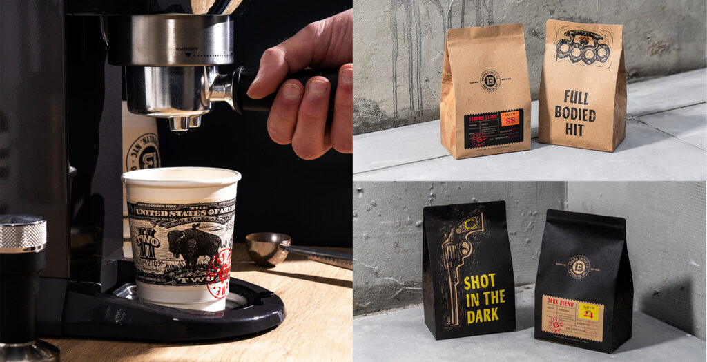
Designed by: PepsiCo Design & Innovation
Country: United States

The Handshake

The Handshake

Designed brainCELLS | Country: Australia

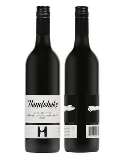
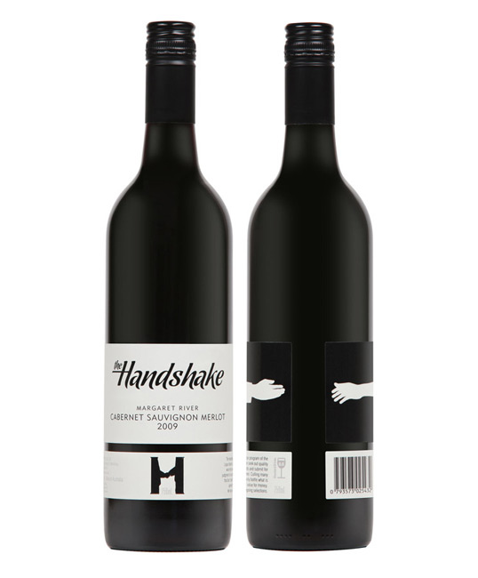
“In 2010 brianCELLS designed a new series of wine labels for a well respected West Australian Liquor merchant, Liquor Barons.

As the label describes, ‘The handshake is an in-house program of the Liquor Barons Co-operative. We seek out quality wine from renowned vineyards and submit for judgement to our distinguished panel. Culling many that don’t make the grade, we only bottle what is agreed to be exceptional value for money. We hope you enjoy our ongoing selections.’

The handshake concept is re-enforced through the use of a minimal typographic front label that wraps around the bottle to reveal two hands about to shake with each other. Thus, rewarding customers who pick up the bottle off the shelf.”

The Handshake

The Handshake

Get the latest packaging design inspiration in your inbox:

Popular designs

Laphroaig’s Wellington Boot-Inspired Gift Packaging Design

Laphroaig leverages story-telling to engage new drinkers, transforming the iconic green wellies into a giftable, reusable packaging for their single malt whisky. The wellie-inspired design disrupts traditional Scotch packaging, adding a playful touch to the brand’s history.

Dama Blanca: Packaging Design for Salt of Cádiz

Discover the artisanal salt packaging design for Dama Blanca, a family project from Salinas of Cádiz. The design reflects the brand’s 3000-year history, authenticity and love for the sea, using natural materials and a sea-inspired palette.

Designed by: PepsiCo Design & Innovation
Country: United States

The Handshake

Handshake1

The Handshake

Designed brainCELLS | Country: Australia

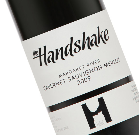
“In 2010 brianCELLS designed a new series of wine labels for a well respected West Australian Liquor merchant, Liquor Barons.

As the label describes, ‘The handshake is an in-house program of the Liquor Barons Co-operative. We seek out quality wine from renowned vineyards and submit for judgement to our distinguished panel. Culling many that don’t make the grade, we only bottle what is agreed to be exceptional value for money. We hope you enjoy our ongoing selections.’

The handshake concept is re-enforced through the use of a minimal typographic front label that wraps around the bottle to reveal two hands about to shake with each other. Thus, rewarding customers who pick up the bottle off the shelf.”
The Handshake

The Handshake

Previous slide
Next slide
Get the latest on packaging design in your inbox: