Latest in package design

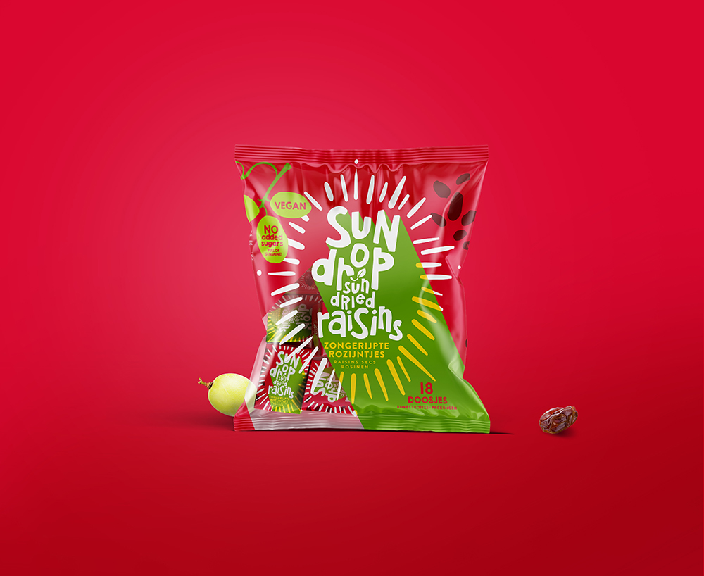
This concept by Joost Identities underlies the redesigned packaging for Sundrop Raisins. In this design, the grape acts as the central point of a sundial, symbolizing


Popular designs
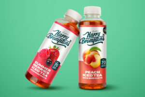
Harry Brompton’s Iced Tea Unveils New Packaging Design by Gency
Discover the vibrant new look of Harry Brompton’s Iced Tea, masterfully redesigned by Gency, and taste the summer with the introduction of their refreshing new Summer Berries flavour. Dive into a world where design meets deliciousness and experience the finest RTD tea.
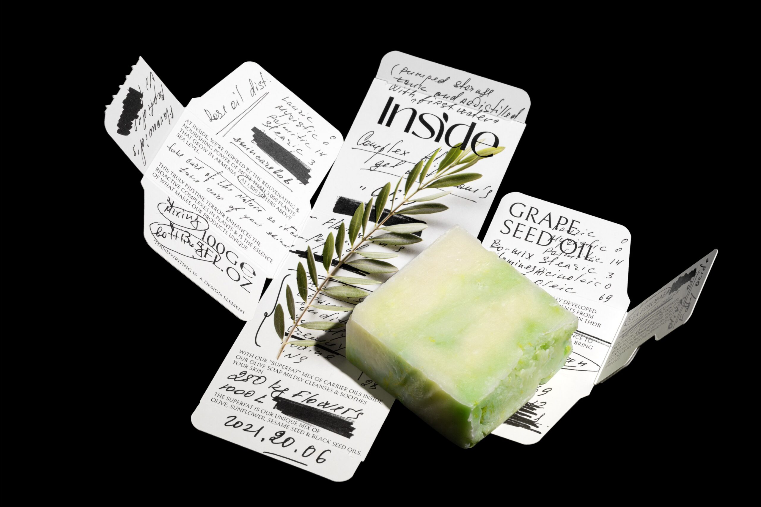
Exploring Inside Skincare Lab’s Unique Packaging Displaying the Chemist’s Notes
“Inside Skincare Lab’s packaging design showcases the meticulous process behind their natural skincare products. With details hidden within the packaging, customers can explore the journey of product creation from the Armenian Highlands.”

Grace O’Malley Whiskey: A Blend of Premium Taste and Legendary Irish Storytelling in Packaging Design
Grace O’Malley Irish Whiskey’s premium handcrafted creations draw inspiration from its namesake, the legendary pirate Queen. Aged in casks by the salty sea, the whiskey reflects O’Malley’s powerful, timeless character in taste and packaging design.

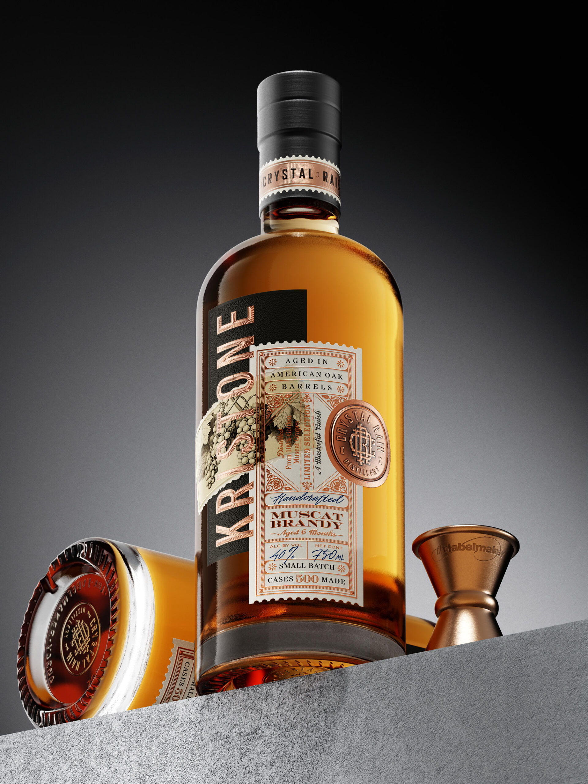
Crafting the Perfect Blend: The Artistry Behind Kristone Craft Grape Brandy Label Design
Explore the artistry behind the fused label design of Kristone Craft Grape Brandy, a testament to the craftsmanship, innovation and dedication of Crystal Rain Distillery. Discover how tradition meets modernity in packaging design.
Radiant Redesign of Sundrop Raisins Packaging
This concept by Joost Identities underlies the redesigned packaging for Sundrop Raisins. In this design, the grape acts as the central point

