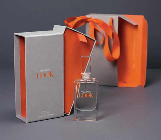
Designed by Monahan & Rhee | Country: United States | Font used: Bodoni “For Vera Wang’s newest fragrance, Monahan & Rhee designed a secondary packaging program
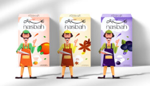
Uncover how the Egyptian product “Nasbah” is taking a contemporary approach to package design, making a mark in the local market. Learn how the design strategy influences consumer perception and enhances product appeal.
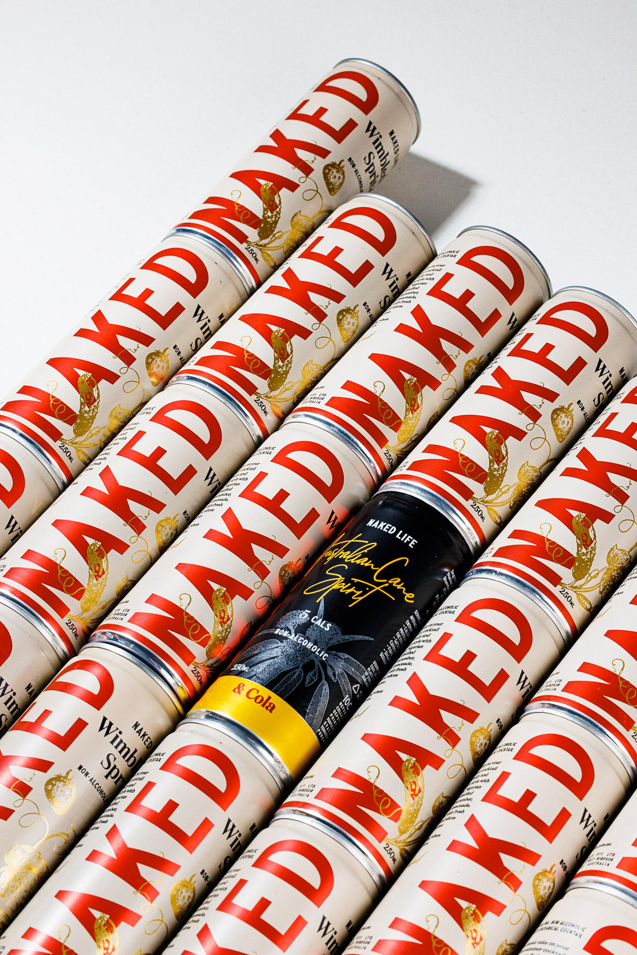
“Naked Life Spirits’ non-alcoholic cocktails are showcased in a captivating series of images. The minimalist compositions and dreamy lighting reflect the brand’s commitment to elegance and authenticity, offering consumers aspirational, sophisticated alternatives.”
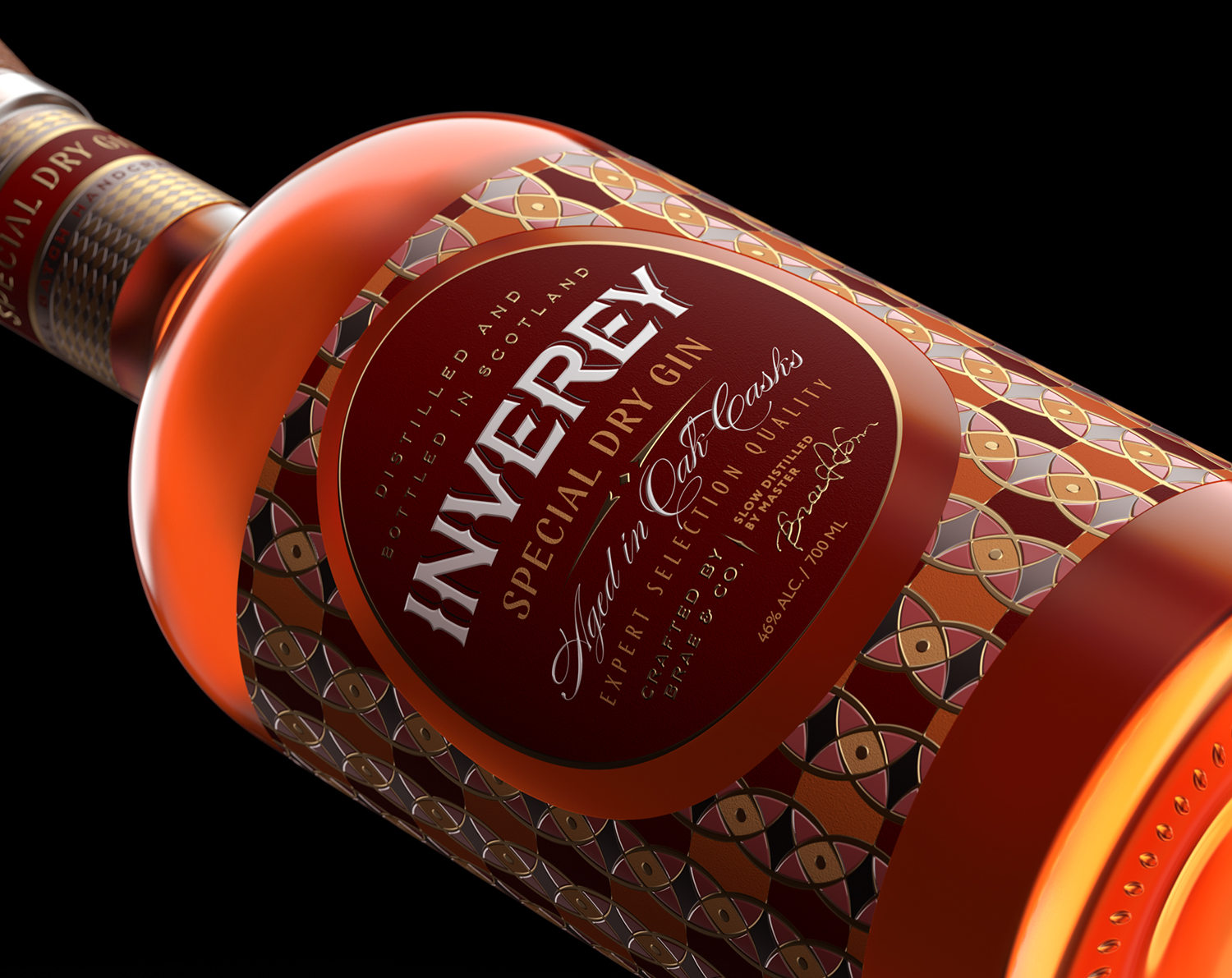
Inverey stands out with its image that captures the essence of the rugged Highland countryside. Breaking away from the norm, the label design does not feature the traditional tartan. Instead, it presents an organised structure of intertwining circles, rhombuses, four-pointed stars and dots born out of their intersection.
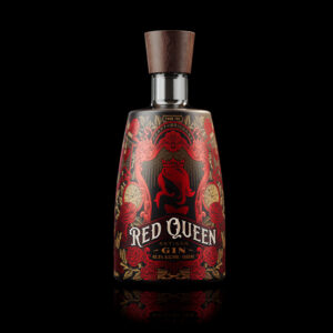
Discover Red Queen Artisan Gin, a juniper-forward spirit with citrus notes & a hint of rose, handcrafted in Brisbane City. The gin’s label design reflects its masterful and delicate composition.
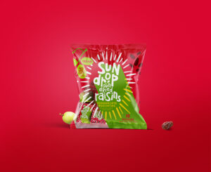
This concept by Joost Identities underlies the redesigned packaging for Sundrop Raisins. In this design, the grape acts as the central point