Latest in package design


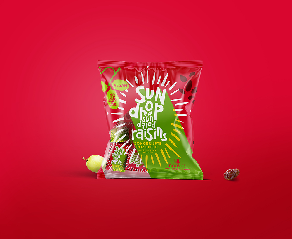
This concept by Joost Identities underlies the redesigned packaging for Sundrop Raisins. In this design, the grape acts as the central point of a sundial, symbolizing
Popular designs

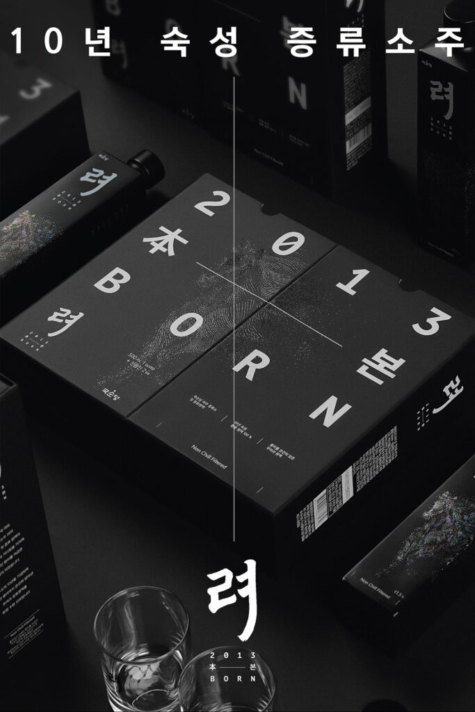
KookSoonDang’s REA 2013 BORN: A Blend of Tradition and Modernity in Soju Packaging Design
Explore the harmonious fusion of modern design and traditional Korean craftsmanship in KookSoonDang’s REA 2013 BORN premium distilled soju. The design carries a narrative and embodies Korean soju heritage.

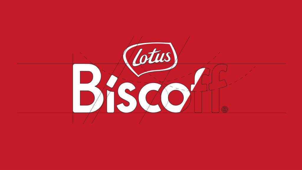
Lotus Biscoff Unveils New Global Brand Identity and Packaging Design by BrandMe
Belgian cookie brand Lotus Biscoff unveils its new global brand identity and packaging design, crafted by BrandMe. The aim is to modernise the brand, increase global recognition, and better appeal to consumers.
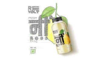
Revolt: An Innovative Blend of Tradition and Modernity in Beverage Packaging Design
Revolt, the trailblazing brand under Truangle, unites modernity with tradition in India’s FMCG landscape. Its beverage labels sport Devanagari script, dismantling linguistic barriers and fostering a sense of pride and connection among consumers.
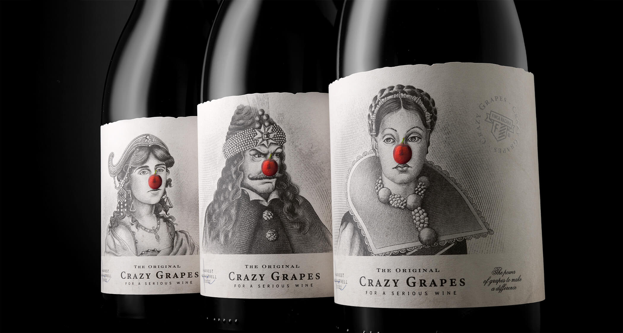
Transformative Power of Wine: Introducing Crazy Grapes
Discover the transformative power of wine with Crazy Grapes. These Monatrell grapes have the magical ability to turn a simple meal into a tribute, a date into an experience, and a gray evening into a party.

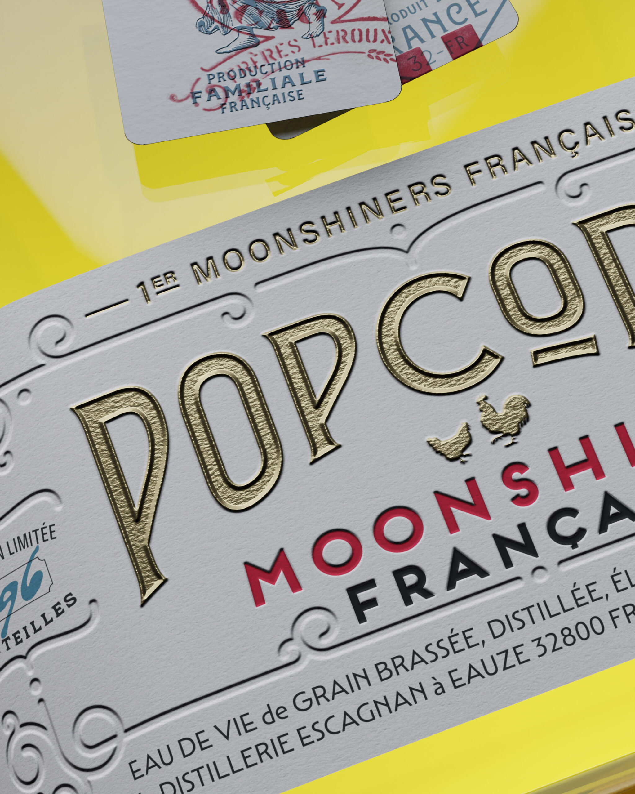
Not Your Usual Popcorn: A French Moonshine with Unique Packaging Design
Explore Popcorn, a unique corn-based French moonshine crafted in the southwest of France. Indulge in this backyard delight, a gourmet treat you can peck at leisure.


