Designed by: PepsiCo Design & Innovation
Country: United States

1000 Paladares

1000 Paladares

Designed by Aetlier Nunes e Pã | Country: Portugal

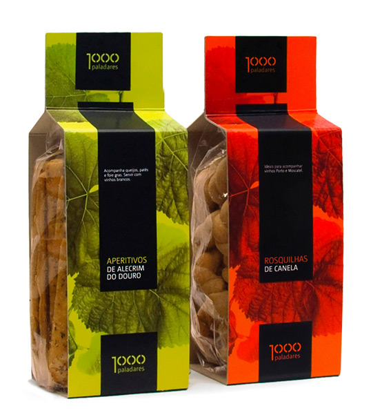
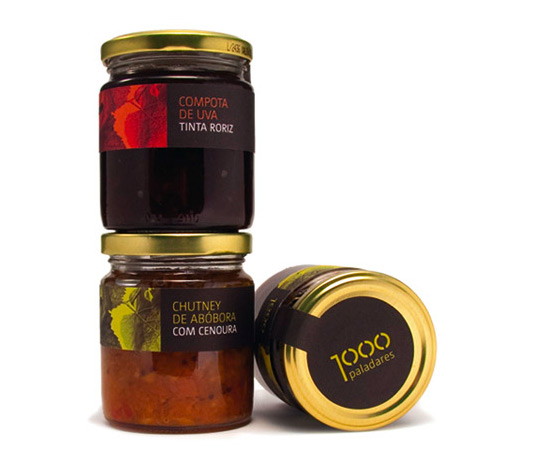
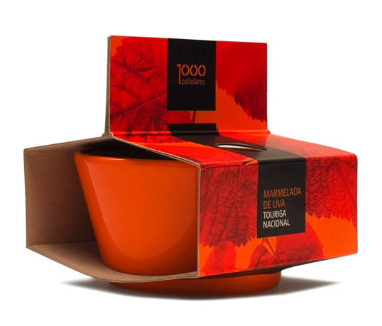
“1000 paladares” (meaning – “a thousand flavors”) is a gourmet brand strongly related to Douro Wine Region, a unique demarcated region in Portugal famous for the Port wine industry, and the origin of the ingredients used in all the brand products. To reflect this attitude towards the selection of ingredients, the products are divided by color (green for the salty and red for the sweeter) as two of the possible thousand flavors. Likewise, the wine leaf is the base element as a reference to its origin.

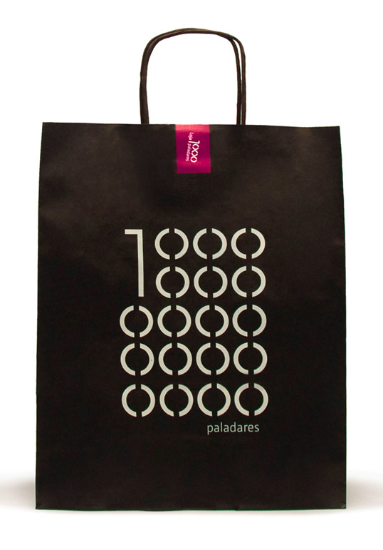
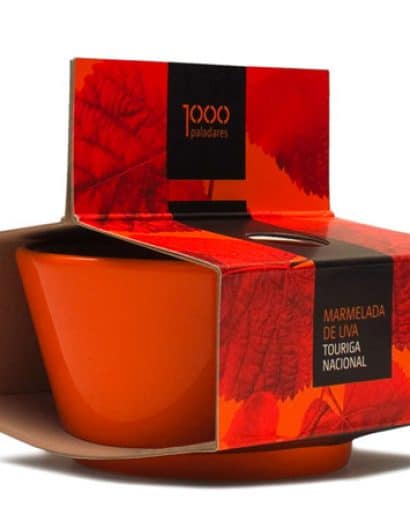
As a logo, the numerical “thousand” allows to create nice solutions for the communication materials repeating the “0” zero. The packaging (both cookies and marmalade ) is highly versatile in the way that it allows the creation of different displays for the product by combining its different sides. The goal was to create an image for the brand that reflects its strong personality as well as to create a fresh and strong approach to the gourmet products in the Douro Wine Region. The client was also looking for a simple solution to distinguish the products and a packaging that allowed it to be displayed in various ways.”

1000 Paladares

1000 Paladares

1000 Paladares

1000 Paladares

Get the latest packaging design inspiration in your inbox:

Popular designs

Mar de Anemonas – Underwater Aged Wine

Discover the unique packaging design of this underwater-aged wine, featuring a vintage label tied with a rope and a small book. Each bottle gains originality as marine life adheres to it during sea-bottom aging.

Designed by: PepsiCo Design & Innovation
Country: United States

1000 Paladares

paladares1

1000 Paladares

Designed by Aetlier Nunes e Pã | Country: Portugal

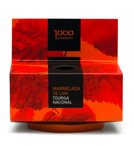
“1000 paladares” (meaning – “a thousand flavors”) is a gourmet brand strongly related to Douro Wine Region, a unique demarcated region in Portugal famous for the Port wine industry, and the origin of the ingredients used in all the brand products. To reflect this attitude towards the selection of ingredients, the products are divided by color (green for the salty and red for the sweeter) as two of the possible thousand flavors. Likewise, the wine leaf is the base element as a reference to its origin.

As a logo, the numerical “thousand” allows to create nice solutions for the communication materials repeating the “0” zero. The packaging (both cookies and marmalade ) is highly versatile in the way that it allows the creation of different displays for the product by combining its different sides. The goal was to create an image for the brand that reflects its strong personality as well as to create a fresh and strong approach to the gourmet products in the Douro Wine Region. The client was also looking for a simple solution to distinguish the products and a packaging that allowed it to be displayed in various ways.”
1000 Paladares

1000 Paladares

1000 Paladares

1000 Paladares

Previous slide
Next slide
Get the latest on packaging design in your inbox: