Designed by arithmetic creative | Country: Canada
“A Bread Affair approached arithmetic to redesign their packaging to more clearly reflect their sense of humour and to re-position their artisan loaves in the organic market place. Arithmetic engaged in consumer research, industry research, consumer testing and produced a positioning strategy that highlighted the distinguishing shopping habits of their consumers.”


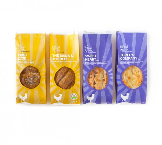
“We introduced two categories: “healthy” breads and “tasty” breads, each organized by colour; purple for tasty and golden yellow to indicate healthy. Next we created the tag-line “Love your organic bakery” and composed cheeky copy for each bread name – a double entendre strategy that played on the characteristics of each loaf while taking into consideration social references of the demographics that purchase the varying bread styles.”


“The artwork is a modern and streamlined representation of the eastern Canadian farmhouse and landscape that the A Bread Affair founders spent many years cooking, entertaining and living on. The sunshine die cut was an organic way of showcasing the distinctive characteristics of each loaf while telling the visual backstory. An extra value detail on the back is the “barn code” showcasing their thoughtful thinking right down to the details. The end result is a packaging re-design for a 15 loaf bread bag program and a dramatic increase in sales… an added plus is that the A Bread Affair consumers love the new names and the founders have an increased attachment to their brand!”