Designed by: PepsiCo Design & Innovation
Country: United States

A.O.

A.O.

Designed by Cowan | Country: Australia

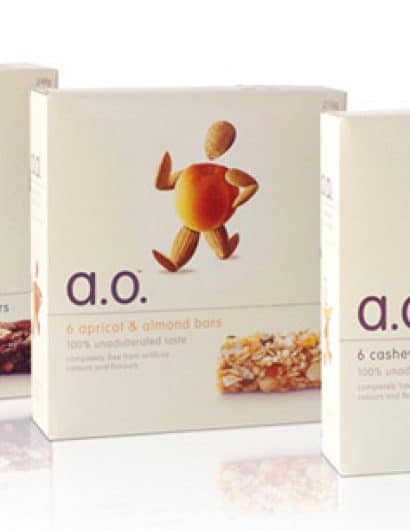
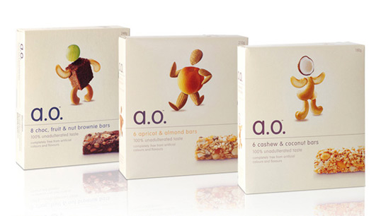
“Adults Only – Muesli bars have traditionally been perceived by consumers as a kids’ snack, finding their way into many school lunchboxes. Whilst there some adult products in the market, no brand offered a ‘wholefood’ style product with delicious taste. The product offering is best described as ‘unadulterated taste’ and the brand name A.O. talks directly to the target market.

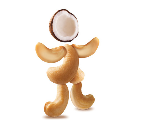
The introduction of the product characters is a humourous and engaging way of communicating the brand proposition of real, wholefood ingredients. The characters formed the basis of the creative across all communication. Clean, simple typography and layout challenged the ‘clutter’ of the existing category.”

A.O.

Get the latest packaging design inspiration in your inbox:

Popular designs

Laphroaig’s Wellington Boot-Inspired Gift Packaging Design

Laphroaig leverages story-telling to engage new drinkers, transforming the iconic green wellies into a giftable, reusable packaging for their single malt whisky. The wellie-inspired design disrupts traditional Scotch packaging, adding a playful touch to the brand’s history.

Wanderers Vodka: A Blend of Nomadic Heritage and Modern Design

The spirit of freedom and adventure is encapsulated in the design of the Wanderers Vodka. Infused with steppe herbs, the complex flavor and unique aroma transport us straight to the vast plains of the Qazaqstan steppe, where nomad tribes traversed the land for thousands of years, shaping its history.

D’eyras – Medrono & Olive Oil

What connects D´EYRAS, Medronho, and Olive Oil? They all hail from the same country: Portugal. These trees are indigenous to the region, serving as a testament to the bountiful and diverse Mediterranean flora.

Designed by: PepsiCo Design & Innovation
Country: United States

A.O.

ao1

A.O.

Designed by Cowan | Country: Australia

“Adults Only – Muesli bars have traditionally been perceived by consumers as a kids’ snack, finding their way into many school lunchboxes. Whilst there some adult products in the market, no brand offered a ‘wholefood’ style product with delicious taste. The product offering is best described as ‘unadulterated taste’ and the brand name A.O. talks directly to the target market.

The introduction of the product characters is a humourous and engaging way of communicating the brand proposition of real, wholefood ingredients. The characters formed the basis of the creative across all communication. Clean, simple typography and layout challenged the ‘clutter’ of the existing category.”
A.O.

Previous slide
Next slide
Get the latest on packaging design in your inbox: