Designed by Designers Anonymous | Country: United Kingdom
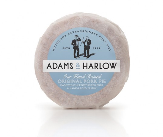
“Sisters Mary and Lizzi Adams appointed us to create the brand identity and packaging for their new brand of pork pies ‘Adams & Harlow’.
Mary and Lizzi Adams are from a family with a long history in pork pie making. Their grandfathers from both sides of the family founded rival pork pie businesses in Lincolnshire in the early 1900s. The sisters required a brand identity that captured the authentic family heritage whilst being stylish with personality.”

“The bespoke logotype is based on a simple sans-serif font common in the early 1900s, it has some quirks within the lettering to make it unique. The ‘S’ is based on a meat hook, reference to the butchers heritage.”

“The identity features Illustrations of both Mr Adams & Mr Harlow based on photographic reference. Across the brand they continue their longstanding friendly rivalry, both attempting to out-do each other with their “extraordinary pork pies”.
Mr Adams is wearing a ‘Pork pie hat’, which he was known for wearing.”