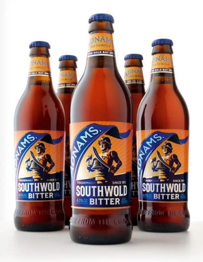
Designed by CookChick Design | Country: United Kingdom
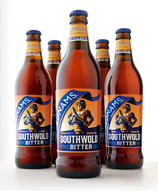
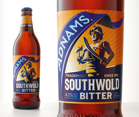
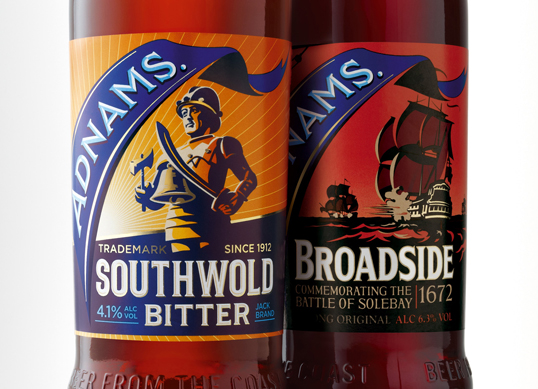
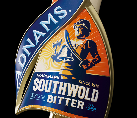
“CookChick Design has re-designed Adnams no.1 real ale brand. The re-design covers pump clips and take home packaging along with other launch & POS items.
Following the succesful re-design of Adnams Broadside last year and as part of an on going programme, CookChick has been tasked with enhancing the unique character and stories behind each of the brands in the Adnams beer portfolio.
The ‘Southwold Jack’ has been evolved as the brand icon for Southwold Bitter. It is an icon that has been associated with Adnams for almost 100 years. A statue synonymous with the town since 1400 can still be found today in the heart of the town ‘protecting’ the brewery.”

