Designed by: PepsiCo Design & Innovation
Country: United States

Alton Brown

alton1

Designed by Hampus Jageland | Country: Australia | Fonts used: FF Sari

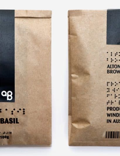
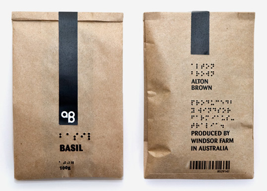
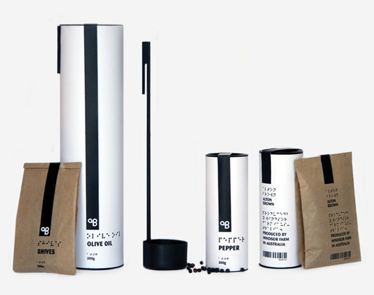
“Alton Brown is a spice range for blind and visually impaired people. The range also includes olive oil and balsamic vinegar. Together with these liquids a special spoon is provided which makes it easier to pour and measure them, it’s the measure of a tablespoon. The text is placed on the exact same place on all the products and all the braille is embossed. The tubes are made out of PLA to make them sustainable and the refill bags are made out of recycled paper. The logo is communicating the exact same thing for blind as for the non blind since A is one dot and B is two.”
alton2

Get the latest packaging design inspiration in your inbox:

Popular designs

Over the wave

This Kombucha originates in Lombok, Indonesia, where its paradise beaches attract hundreds of surfers eager to ride the waves. When you surf,

Far Out Bar

Description: Far Out Bar is a cutting-edge packaging design project created for High Life Farms’ macrodose THC chocolate bars. This project involved

The Bra Guru

Most women are wearing the wrong size bra and that is a fact. The Bra Guru® is the first and only professional

Pure Persian Honey

When we look closely at honey packaging, they are almost all in the usual format, and the ultimate in creativity is that

Designed by: PepsiCo Design & Innovation
Country: United States

Alton Brown

alton1

alton1

Designed by Hampus Jageland | Country: Australia | Fonts used: FF Sari

“Alton Brown is a spice range for blind and visually impaired people. The range also includes olive oil and balsamic vinegar. Together with these liquids a special spoon is provided which makes it easier to pour and measure them, it’s the measure of a tablespoon. The text is placed on the exact same place on all the products and all the braille is embossed. The tubes are made out of PLA to make them sustainable and the refill bags are made out of recycled paper. The logo is communicating the exact same thing for blind as for the non blind since A is one dot and B is two.”

alton2

Explore more great package design

Get the latest on packaging design in your inbox: