Designed by: PepsiCo Design & Innovation
Country: United States

Apotek Hjärtat

Apotek Hjärtat

Designed by BVD | Country: Sweden

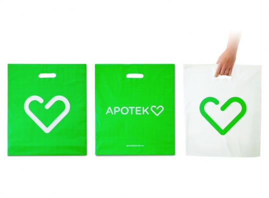
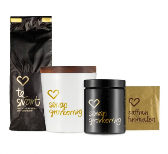
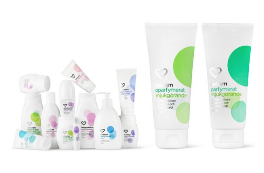
Challenge: The Swedish pharmacy market was privatized in November 2009. In February 2010 Apotek Hjärtat opened, as the largest independent player on the deregulated pharmacy market with 207 pharmacies. Apotek Hjärtat wanted their new graphic identity to communicate credibility, knowledge and health in a modern and inspiring manner as well as signifying a pharmacy in a clear but subtle way. The logotype should be able to be applied to many different types of media profiles.

Solution: Our aim was to create a logo that could win the hearts of the Swedish people. The greatest challenge was to find a balance between knowledge and credibility on one hand, and cordiality and service on the other. The traffic-light green colour is an obvious signal that is easy to see and identify. The iconic heart symbol is unique because of its opening in the centre, which creates a feeling of openness and welcome.”

Apotek Hjärtat

Apotek Hjärtat

Get the latest packaging design inspiration in your inbox:

Popular designs

Designed by: PepsiCo Design & Innovation
Country: United States

Apotek Hjärtat

lovely-package-apotek-hjartat1

Apotek Hjärtat

Designed by BVD | Country: Sweden

Challenge: The Swedish pharmacy market was privatized in November 2009. In February 2010 Apotek Hjärtat opened, as the largest independent player on the deregulated pharmacy market with 207 pharmacies. Apotek Hjärtat wanted their new graphic identity to communicate credibility, knowledge and health in a modern and inspiring manner as well as signifying a pharmacy in a clear but subtle way. The logotype should be able to be applied to many different types of media profiles.

Solution: Our aim was to create a logo that could win the hearts of the Swedish people. The greatest challenge was to find a balance between knowledge and credibility on one hand, and cordiality and service on the other. The traffic-light green colour is an obvious signal that is easy to see and identify. The iconic heart symbol is unique because of its opening in the centre, which creates a feeling of openness and welcome.”
Apotek Hjärtat

Apotek Hjärtat

Previous slide
Next slide
Get the latest on packaging design in your inbox: