Arctic Beer
March 23, 2011 | 6 Comments
Designed by Tank | Country: Norway
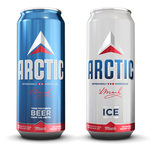
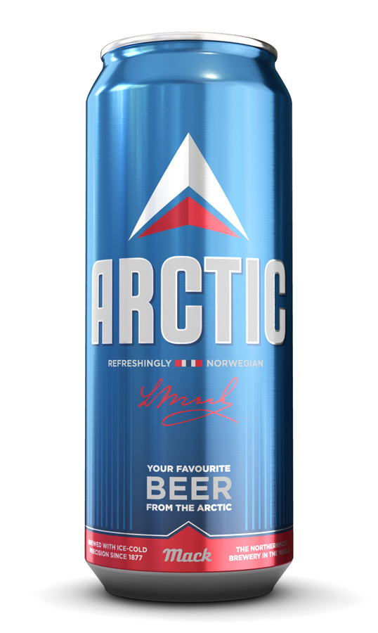
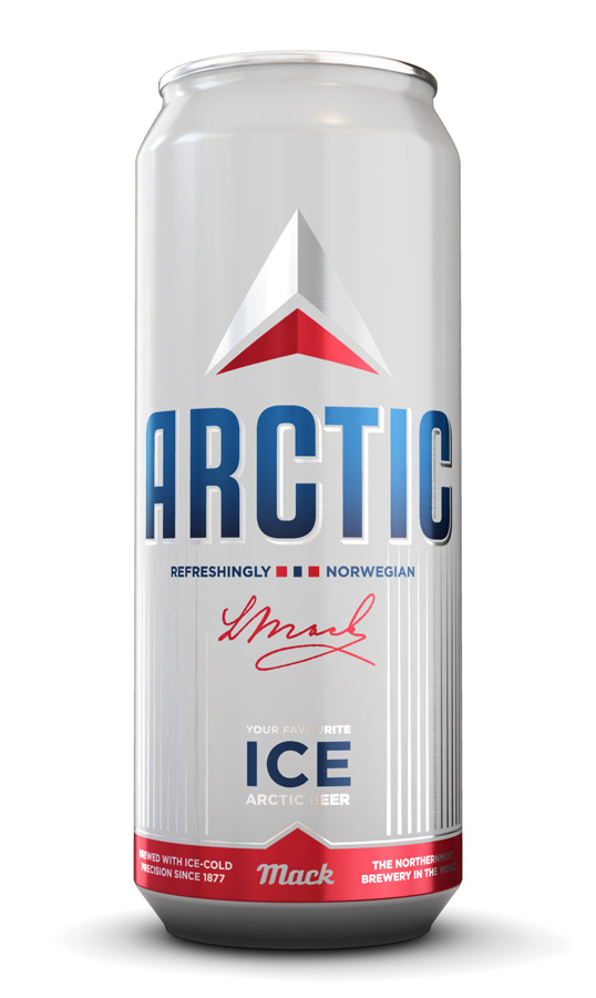
“The brief: Mack’s number one-product, Arctic Beer, was changed from being a standalone product, to a series including Light and Ice versions. The client wanted a modern and young look with similarities from the predecessor – while at the same time being something new and fresh.
The solution extends and simplifies the elements that were the mainstay of the identity, but with more emphasis on the brand name and the cold freshness. The arctic purity, the clear and fresh water it is made of, and the brewery being the worlds northernmost, is the very base of the concept. It shows off in the clear blue color and ice sharp arrow that points you in the northern direction. It is freezing cold. It is refreshingly tasty. It is Arctic Beer.”
Comments
Warning: count(): Parameter must be an array or an object that implements Countable in /nfs/c02/h06/mnt/28959/domains/lovelypackage.com/html/wp-includes/class-wp-comment-query.php on line 399
6 Responses to “Arctic Beer”
Your Comment
March 23rd, 2011 @ 12:14 pm
I kind of like this.. I’d be love to see the can that it replaced though.
March 23rd, 2011 @ 1:41 pm
I think this is the old one, from 2008:
http://www.aperitif.no/images/95054/Mack-Arctic-Beer-50cl-160h.jpg
I also found this one, from 2005:
http://www.aperitif.no/images/66460/Mack-Arctic-Beer-05l-160h.jpg
March 23rd, 2011 @ 2:03 pm
looks like the delta airlines logo
http://www.businesstravellogue.com/files/2007/11/delta.GIF
March 23rd, 2011 @ 2:25 pm
Delta Airlines?
March 23rd, 2011 @ 3:20 pm
The old one: http://img.fotocommunity.com/images/Norway/Northern-Norway/Arctic-Beer-a23080510.jpg
May 27th, 2011 @ 3:40 pm
I would like to take this opportunity to thank the fine folks who work for Mr. Ludwig Mack at his brewery in Tromsø.
I am particularly fond of their re-branding of their ARCTIC Beer cans with big bold letters. Although I was quite happy with the old Polar bear on the ice flow label (which held a striking resemblance to the Norway’s national hockey team’s jersey) I do however like the new design.
Yes just as the can says it is “Refreshingly Norwegian”. I hope the employee who suggested that they put that bright and shiny red pull tab on the top got an extra little something in his wage pouch.
It has the same mesmerising effect on a middle aged beer drinker as it would if used as a fishing spoon on a river trout…..
Yes I think I will have another….