Designed by: PepsiCo Design & Innovation
Country: United States

Babees Honey

1

Babees Honey

Designed by Ah&Oh Studio | Country: Poland

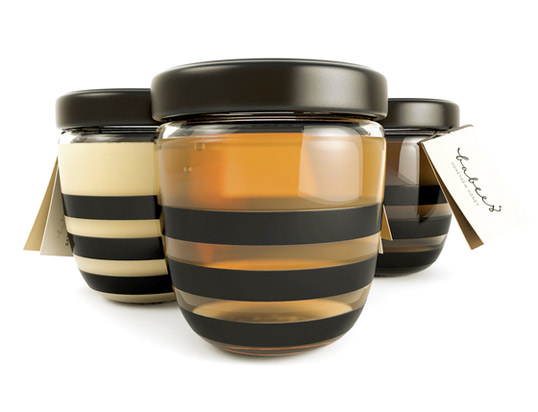
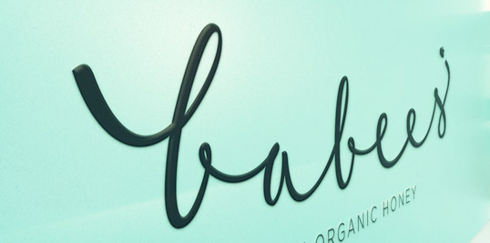
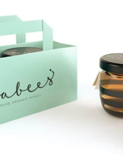
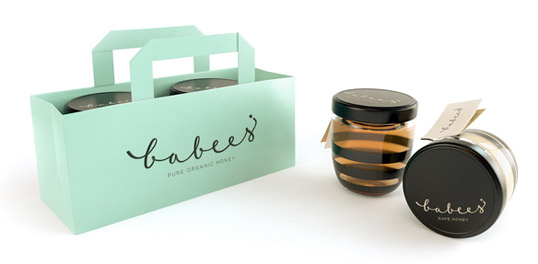
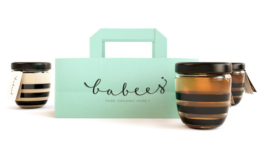
“A simple and litlle idea of packing for honey. We tried to treat jar as a playground for a character design. Dark cap and stripes made the idea quite clear. Through this project we tried to encourage kids to reach for honey instead of refined sugar. Especially for them we create logo which smiles bee’s face. It’s hand calligraphed, custom made, and it softens the overall simple, geometric look of the packaging.”

Babees Honey

Babees Honey

Babees Honey

1

Get the latest packaging design inspiration in your inbox:

Popular designs

Over the wave

This Kombucha originates in Lombok, Indonesia, where its paradise beaches attract hundreds of surfers eager to ride the waves. When you surf,

The Bra Guru

Most women are wearing the wrong size bra and that is a fact. The Bra Guru® is the first and only professional

Pure Persian Honey

When we look closely at honey packaging, they are almost all in the usual format, and the ultimate in creativity is that

Designed by: PepsiCo Design & Innovation
Country: United States

Babees Honey

1
babees2

Babees Honey

Designed by Ah&Oh Studio | Country: Poland

“A simple and litlle idea of packing for honey. We tried to treat jar as a playground for a character design. Dark cap and stripes made the idea quite clear. Through this project we tried to encourage kids to reach for honey instead of refined sugar. Especially for them we create logo which smiles bee’s face. It’s hand calligraphed, custom made, and it softens the overall simple, geometric look of the packaging.”
Babees Honey

Babees Honey

Babees Honey

1
Previous slide
Next slide

Explore more great package design

Get the latest on packaging design in your inbox: