Designed by: PepsiCo Design & Innovation
Country: United States

Back&Forth – Unavoidable Casualty

backforth1

Designed by ThinConsolation | Country: Belgium

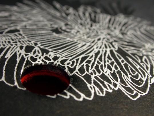
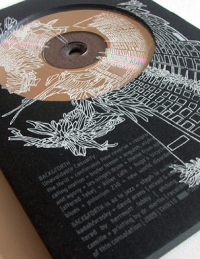
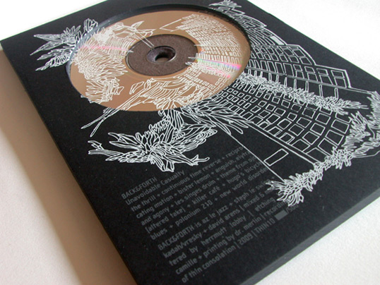
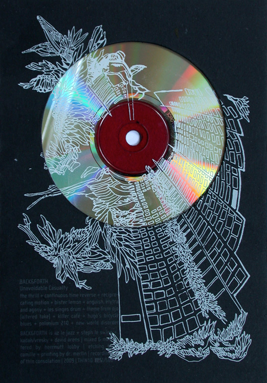
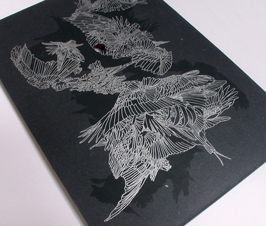
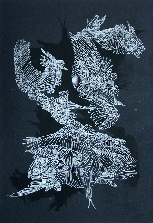
“We decided to have a sleeve close to the DVD format. After some tests, we agreed on 3 layers of cardboard with a big hole to see the CD, an opening on right side where you drag the CD and a small hole on the back side (this hole matches perfect with center of the CD, but is just for aesthetics). We added some felt where you put the CD which comes in red or grey.

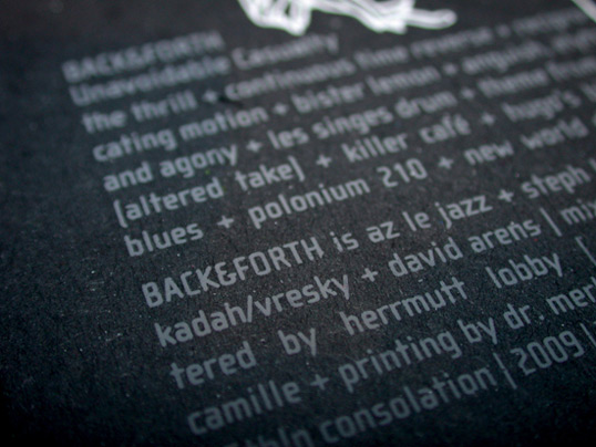
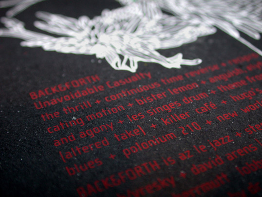
For the graphics, the musicians wanted something without 90º angles and we (at the label) wanted something with a lot of detail, a reminder of their music. A friend – Camille, makes etchings and was working on feathers… We decided to work with her. It was going to be a bit too though to make 500 + promos copies only by etching, so we decided to screen print her work instead. We used white and red or grey for the front (it depend of the felt) and black + silver for the back.”
backforth2

backforth3

backforth4

backforth5

backforth6

backforth7

Get the latest packaging design inspiration in your inbox:

Popular designs

The Port Vodka Lemon Water

Overview: In response to my client’s vision for a Cape Cod themed beverage brand, I embarked on the journey to create The Port

Burma Love Rebrand

Love at First BiteAs an extension of the Burma Superstar restaurant in San Francisco, Burma Love Foods gives diners an opportunity to

Designed by: PepsiCo Design & Innovation
Country: United States

Back&Forth – Unavoidable Casualty

backforth1

backforth1

Designed by ThinConsolation | Country: Belgium

“We decided to have a sleeve close to the DVD format. After some tests, we agreed on 3 layers of cardboard with a big hole to see the CD, an opening on right side where you drag the CD and a small hole on the back side (this hole matches perfect with center of the CD, but is just for aesthetics). We added some felt where you put the CD which comes in red or grey.

For the graphics, the musicians wanted something without 90º angles and we (at the label) wanted something with a lot of detail, a reminder of their music. A friend – Camille, makes etchings and was working on feathers… We decided to work with her. It was going to be a bit too though to make 500 + promos copies only by etching, so we decided to screen print her work instead. We used white and red or grey for the front (it depend of the felt) and black + silver for the back.”
backforth2

backforth3

backforth4

backforth5

backforth6

backforth7

Explore more great package design

Get the latest on packaging design in your inbox: