Ballard Bee Company
October 10, 2011 | 4 Comments
Designed by TKTJ Design | Country: United States
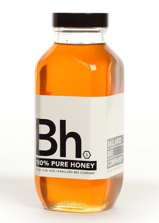
“The design is based on the idea of honey being so basic, we created a chemical symbol “Bh” all for itself. The element is a pure chemical substance, that cannot be broken down in further, and by placing this honey within this realm it allows it to take on the idea of honey as purity. The packaging also seems to suggest something medicinal about the product, which is interesting considering honey has long been touted for many other things than just a sweetener.”
Comments
Warning: count(): Parameter must be an array or an object that implements Countable in /nfs/c02/h06/mnt/28959/domains/lovelypackage.com/html/wp-includes/class-wp-comment-query.php on line 399
4 Responses to “Ballard Bee Company”
Your Comment
October 10th, 2011 @ 10:20 am
Very nice project, clean and objective, most of people usually use honey as a medicine. At least in my country does.
October 10th, 2011 @ 10:53 am
This is an awesome, minimalist design for a honey company. I wish more apiaries would push for better designs of their products considering the decreasing bee population. Good stuff.
October 11th, 2011 @ 1:19 am
I do like it from a design point of view but I don’t think this really has a place in the commercial world. While it is used as a medicine and it does nail that sensibility it looses the warmth and comfort associated with putting it in a cup of tea, spreading it on toast or in a cake. Honey is the summer and this aesthetic lacks this warm quality.
A great conceptual exercise nonetheless.
October 12th, 2011 @ 11:00 am
The design and layout is great!