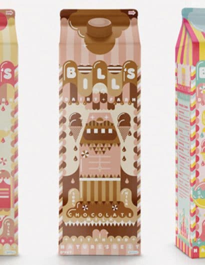
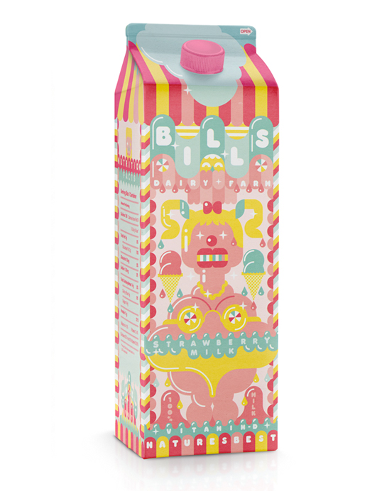
Bill’s Milkshakes
April 17, 2010 | 7 Comments
Designed by ILoveDust | Country: United Kingdom
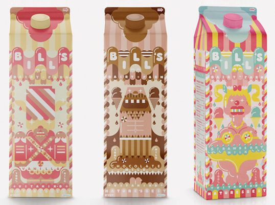
“Some prototype packaging for Bill’s Milkshakes. We took the the Chocolate, Strawberry and Vanilla and gave them a huge overhaul.”
Comments
Warning: count(): Parameter must be an array or an object that implements Countable in /nfs/c02/h06/mnt/28959/domains/lovelypackage.com/html/wp-includes/class-wp-comment-query.php on line 399
7 Responses to “Bill’s Milkshakes”
Your Comment
April 17th, 2010 @ 8:35 am
In addition to being a delightful design, it’s also effective. It makes my brain recall flavors of childhood—and my salivary glands kick into overdrive. It makes me want a milkshake NOW!
April 17th, 2010 @ 9:16 am
Very colorful, kids will love these.
April 17th, 2010 @ 3:51 pm
Reminds me a lot of Siggi Eggertsen, both the illustration style and his subtle washed out colour palette. Check out http://www.vanillusaft.com to see the similarities.
April 19th, 2010 @ 6:52 am
I love these—great illustrations and a nice way of using the soft and swooshy feel of traditional flavoured milk packaging without resorting to clichés.
I wonder, though, about the wisdom of using pink on a design for Vanilla Milk. Surely consumers could mistake it, as I did, for Strawberry? Maybe a more muted range of creams and blues is a better choice for this particular packaging concept.
April 19th, 2010 @ 8:03 am
Wow, love the design – makes me want a milkshake too !!
April 19th, 2010 @ 8:36 am
I really enjoy the illustration style of these products, though I do agree with Chirstopher.
Another thing that confused me a little was the choice of characters… a very full figured woman spilling out of her bikini may not be the best motivator for woman choosing a ‘treat’ flavor of milk…
April 25th, 2010 @ 10:57 pm
The colors remind me of the Chupa Chubs lollipops that were available when I was a kid.