Designed by: PepsiCo Design & Innovation
Country: United States

Brewing Költur

lovely-package-koltur-2

Designed by The Kitchen | Country: Sweden

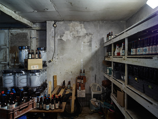
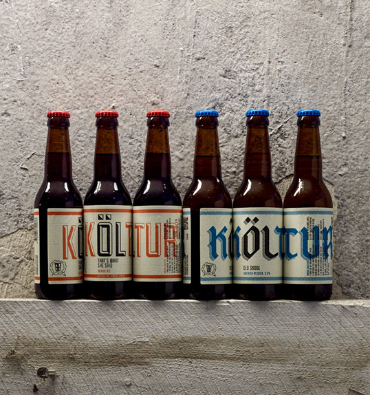
“The work is for a small craft brewery based just outside of Stockholm called Brewing Költur. Being a small start up with obviously no budget they asked for a label that they would be able to update themselves with low design abilities needed.

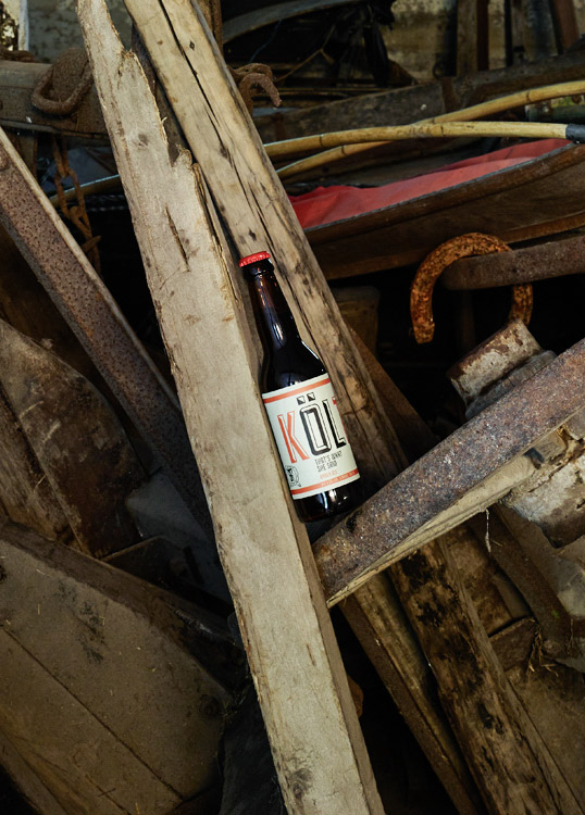
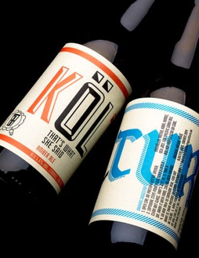
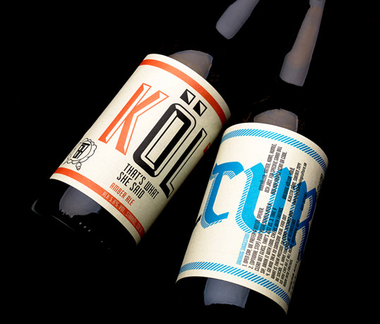
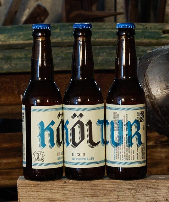
What we came up with was quite simple, and the answer was given to us in their name. Their name is a play on the words Brewing Culture (Brewing Kultur), they simply changed culture to Költur, ÖL in English means Beer, so this to us defined what the label should look like. We chose two (well crafted) low cost typefaces to reflect their first two beers, putting emphasis on the work ÖL and placing it on the front of the bottle. Simply stating ‘this is beer’.

The simplicity of the design means that the client from now on is purely in control of the whole beer process, from brewing to final labelling and design of the product. All they need to do is to choose a font that represents their beer and place the ÖL on the front. In this way is becomes for them a very natural experimental progression.”
lovely-package-koltur-1 lovely-package-koltur-3 lovely-package-koltur-6 lovely-package-koltur-5 lovely-package-koltur-4

Get the latest packaging design inspiration in your inbox:

Popular designs

Rebranding Mayawell: A Blend of Mexican Heritage and Healthy Living

Discover Mayawell, a Mexican-owned beverage company that celebrates its heritage with natural, organic, and prebiotic drinks. The rebranding strikes a balance between traditional elements and contemporary design, offering a unique, healthy alternative to traditional sodas.

Laphroaig’s Wellington Boot-Inspired Gift Packaging Design

Laphroaig leverages story-telling to engage new drinkers, transforming the iconic green wellies into a giftable, reusable packaging for their single malt whisky. The wellie-inspired design disrupts traditional Scotch packaging, adding a playful touch to the brand’s history.

Designed by: PepsiCo Design & Innovation
Country: United States

Brewing Költur

lovely-package-koltur-2

lovely-package-koltur-2

Designed by The Kitchen | Country: Sweden

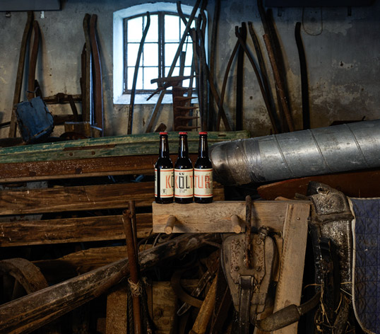
“The work is for a small craft brewery based just outside of Stockholm called Brewing Költur. Being a small start up with obviously no budget they asked for a label that they would be able to update themselves with low design abilities needed.

What we came up with was quite simple, and the answer was given to us in their name. Their name is a play on the words Brewing Culture (Brewing Kultur), they simply changed culture to Költur, ÖL in English means Beer, so this to us defined what the label should look like. We chose two (well crafted) low cost typefaces to reflect their first two beers, putting emphasis on the work ÖL and placing it on the front of the bottle. Simply stating ‘this is beer’.

The simplicity of the design means that the client from now on is purely in control of the whole beer process, from brewing to final labelling and design of the product. All they need to do is to choose a font that represents their beer and place the ÖL on the front. In this way is becomes for them a very natural experimental progression.”
lovely-package-koltur-1 lovely-package-koltur-3 lovely-package-koltur-6 lovely-package-koltur-5 lovely-package-koltur-4

Previous slide
Next slide
Get the latest on packaging design in your inbox: