Designed by: PepsiCo Design & Innovation
Country: United States

Brouwerij ‘t Ij

Brouwerij 't Ij

Designed by Redthumb | Country: The Netherlands

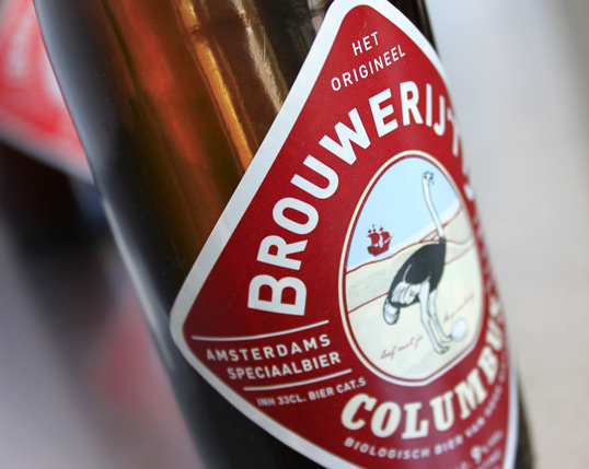
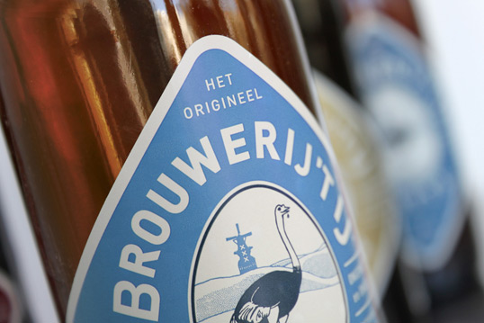
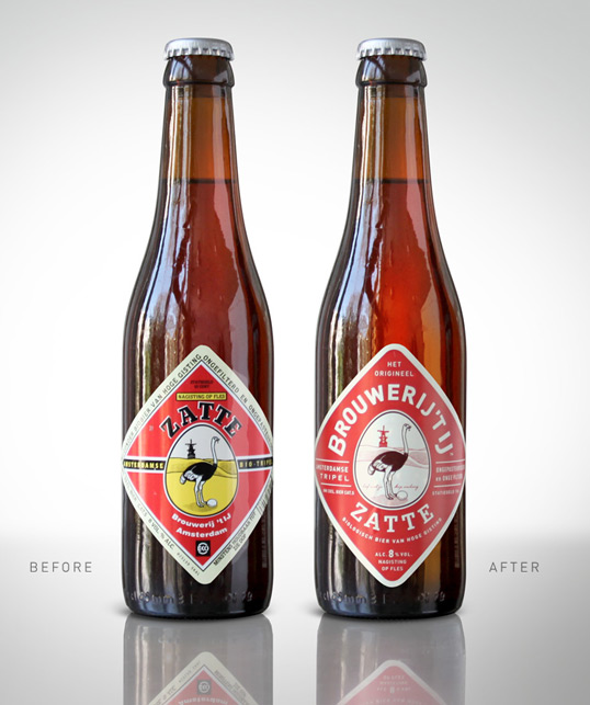
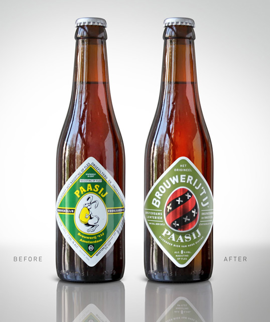
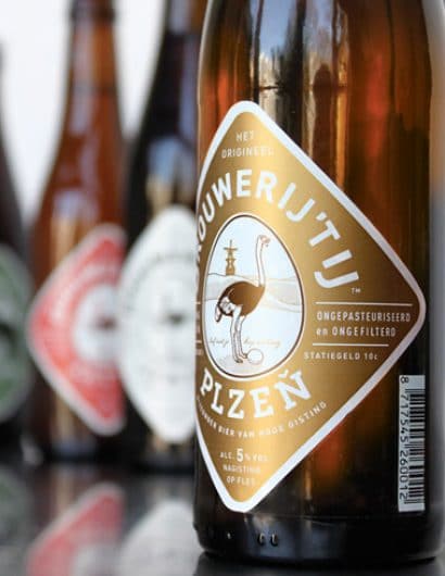
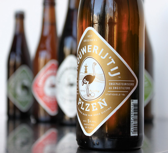
“Brouwerij ‘t Ij is an independent microbrewery, based under a windmill on the side of a canal in Amsterdam, that has become a firm favourite with beer lovers and locals. With a range of 10 strong, mostly organic beers, the brewery has built a reputation for down-to-earth quality, with a quirky, eccentric character. The brewery worked with Redthumb, a small independent branding agency, to turn the look of their range from it’s amateur-looking past through to a new look – reflecting the quality in the beer without losing it’s ‘quirkiness’. The brief was to make the labels work better, look better, and feel better, all without scaring off the brands fanatical followers, and keeping it’s Amsterdam accent.

The new design manages to bring the labels forward without compromise, changing every single element whilst still remaining familiar and authentic. It’s down-to-earth, strong and simple, without taking itself too seriously.The new labels use a new printing process developed with print consultancy Confer which gives a paper-label feel to the plastic label used by the brewery, and also allows a barcode without the need for a separate back label.

The name Brouwerij ‘t Ij means ‘The Ij Brewery‘ – Ij being the name of the body of water at Amsterdam’s waterfront. Phonetically ‘Ij’ also sounds identical to the dutch word for egg.”

Brouwerij 't Ij

Brouwerij 't Ij

Brouwerij 't Ij

Brouwerij 't Ij

Brouwerij 't Ij

Get the latest packaging design inspiration in your inbox:

Popular designs

Burma Love Rebrand

Love at First BiteAs an extension of the Burma Superstar restaurant in San Francisco, Burma Love Foods gives diners an opportunity to

The Bra Guru

Most women are wearing the wrong size bra and that is a fact. The Bra Guru® is the first and only professional

Over the wave

This Kombucha originates in Lombok, Indonesia, where its paradise beaches attract hundreds of surfers eager to ride the waves. When you surf,

Designed by: PepsiCo Design & Innovation
Country: United States

Brouwerij ‘t Ij

brouwer1

Brouwerij 't Ij

Designed by Redthumb | Country: The Netherlands

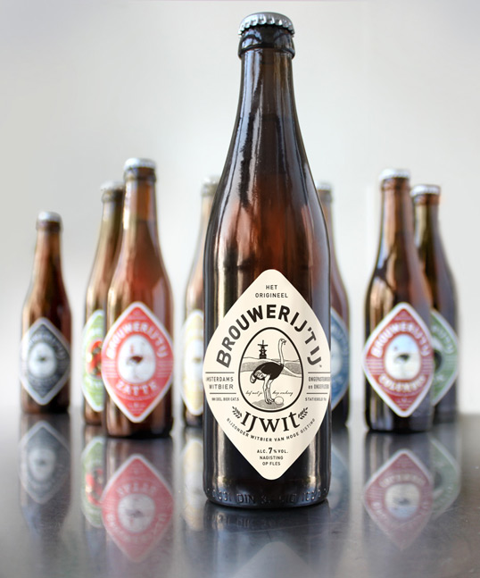
“Brouwerij ‘t Ij is an independent microbrewery, based under a windmill on the side of a canal in Amsterdam, that has become a firm favourite with beer lovers and locals. With a range of 10 strong, mostly organic beers, the brewery has built a reputation for down-to-earth quality, with a quirky, eccentric character. The brewery worked with Redthumb, a small independent branding agency, to turn the look of their range from it’s amateur-looking past through to a new look – reflecting the quality in the beer without losing it’s ‘quirkiness’. The brief was to make the labels work better, look better, and feel better, all without scaring off the brands fanatical followers, and keeping it’s Amsterdam accent.

The new design manages to bring the labels forward without compromise, changing every single element whilst still remaining familiar and authentic. It’s down-to-earth, strong and simple, without taking itself too seriously.The new labels use a new printing process developed with print consultancy Confer which gives a paper-label feel to the plastic label used by the brewery, and also allows a barcode without the need for a separate back label.

The name Brouwerij ‘t Ij means ‘The Ij Brewery‘ – Ij being the name of the body of water at Amsterdam’s waterfront. Phonetically ‘Ij’ also sounds identical to the dutch word for egg.”
Brouwerij 't Ij

Brouwerij 't Ij

Brouwerij 't Ij

Brouwerij 't Ij

Brouwerij 't Ij

Previous slide
Next slide

Explore more great package design

Get the latest on packaging design in your inbox: