Designed by: PepsiCo Design & Innovation
Country: United States

Bru

Bru

Designed by CB’a Design Solutions | Country: France

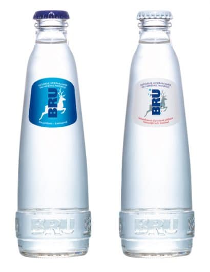
“For this redesign, Spadel collaborated with CB’a Design Solutions in Brussels to make it a success. Among various adaptations that needed to be made (such as having a resealable bottle cap on the 50cl format), the objectives were to make the bottle as sustainable as possible, convenient and modern as the last redesign happened in 1994.

Through the volume and labels, CB’a Brussels focused on giving a timeless while very elegant look to the two product lines: still and sparkling water. Bru is now slimmer and slender and is sitting on a solid base where the name of the brand can be read. The curves are simpler and pure. The differentiation is achieved through a blue or white color-coding. Last but not least, the glass is recycled, the labels’ sizes and the bottle weight have both been reduced to make it eco friendly.

Popular designs

Rebranding Mayawell: A Blend of Mexican Heritage and Healthy Living

Discover Mayawell, a Mexican-owned beverage company that celebrates its heritage with natural, organic, and prebiotic drinks. The rebranding strikes a balance between traditional elements and contemporary design, offering a unique, healthy alternative to traditional sodas.

Innovative Design and Packaging of Teeling Whiskey Crystal Malt

Explore the innovative packaging design of Teeling Whiskey Crystal Malt. A dark screen printed bottle with a Marque™ aluminum label, textural dimension, and a seamless diamond pattern, embodies the brand’s commitment to unconventional expressions.

Designed by: PepsiCo Design & Innovation
Country: United States

Bru

bru

Bru

Designed by CB’a Design Solutions | Country: France

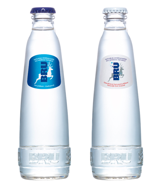
“For this redesign, Spadel collaborated with CB’a Design Solutions in Brussels to make it a success. Among various adaptations that needed to be made (such as having a resealable bottle cap on the 50cl format), the objectives were to make the bottle as sustainable as possible, convenient and modern as the last redesign happened in 1994.

Through the volume and labels, CB’a Brussels focused on giving a timeless while very elegant look to the two product lines: still and sparkling water. Bru is now slimmer and slender and is sitting on a solid base where the name of the brand can be read. The curves are simpler and pure. The differentiation is achieved through a blue or white color-coding. Last but not least, the glass is recycled, the labels’ sizes and the bottle weight have both been reduced to make it eco friendly.

Previous slide
Next slide