Designed by D. Studio | Country: United Kingdom
“Burnt Sugar is a boutique brand of fudge with humble beginnings. Started by Justine Cather, who nabbed her mum’s recipe and took it to market (London’s famous Borough Market to be precise), word soon got out about the delicious lumpy, bumpy pieces of sweetness and its popularity soared.
Having worked with Justine on her gift ranges, she asked us to create a new direction for the brand and redesign the packaging for the core range. Working closely with Justine, we developed the ‘every one is different’ concept, which not only celebrates the perfectly irregular pieces of taste bud-tingling randomness but also all the wonderful variety of foodie folk who like to indulge in her fudge.

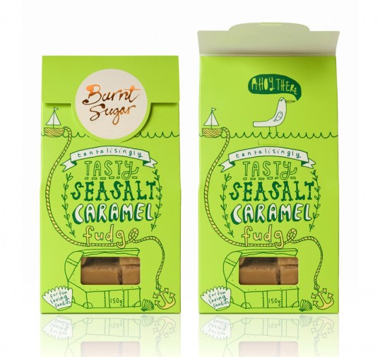
The first thing we did was turn the pack around and tweak the flap to give the impression it was sealed with a sticker. This made it look like the traditional bags the loose fudge is sold in at Borough Market, and instantly communicated the roots of the brand.
We then commissioned five illustrators to ‘doodle’ all over the packs so each product had its own individual personality. Not a single font was used on any of the packs – every element was meticulously hand-rendered, including the back of pack statutory information, right down to the recycle logo and ‘e’ sign.

We also added a little surprise under the flap of each pack for the customers (or fun-loving foodies as Justine prefers to call them) to discover.
Wes Anson, creative partner, d.studio comments “The project was a perfect collaboration from start to finish – we worked closely with Justine on every aspect from concept to copy writing to ensure everything on the pack communicated what’s so unique about Burnt Sugar. It was a real labour of love and we’re chuffed with the results.”