Designed by B&B studio | Country: United Kingdom
“For 20 years, Nespresso has been the king of premium coffee pod systems, its exclusivity guaranteed by restricting capsule sales to specialist stores and online only. But when its design patents expired in 2012, the market for Nespresso-compliant capsules opened up to a host of competitors.
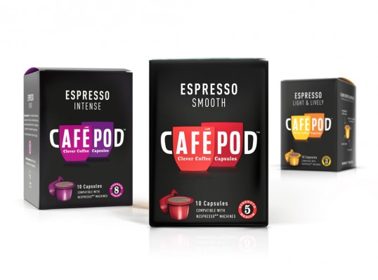
Our friends at Cafépod were first to market with a concise range of coffee pods exclusive to Waitrose stores. With just the name in place, our role was to create a brand identity, packaging and web presence with the potential to encourage Nespresso loyalists to switch to a brand from the supermarket shelves.
Inspired by Cafépod’s desire to democratise a premium product, we set about expressing the social aspect of the coffee moment with a pair of clinking cups. The aesthetic combines gourmet cues, vibrant taste and contemporary character, all carefullly balanced to capture our everyday luxury brief.”