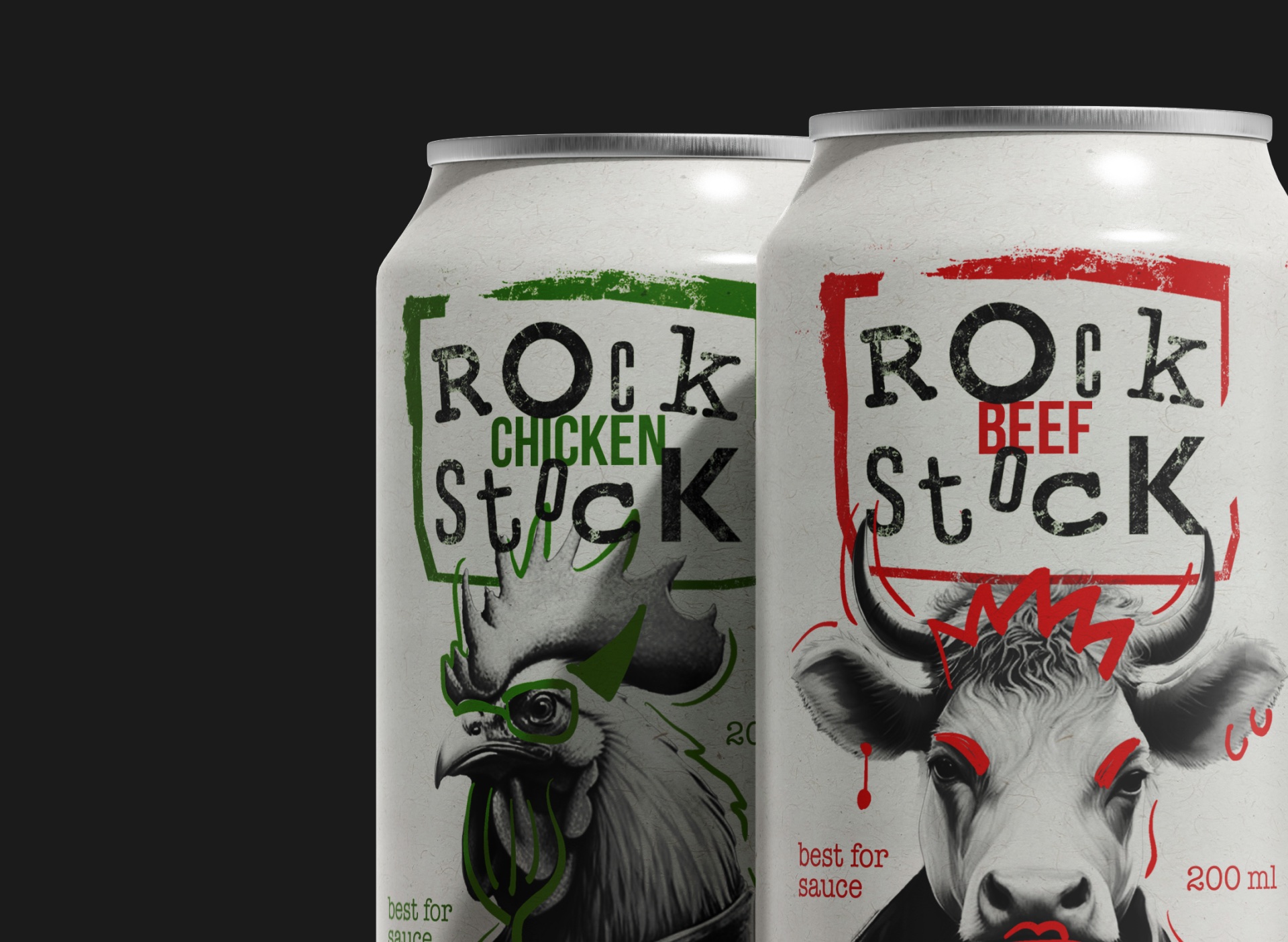
Rock Stock by Liana Bubnova combines rock music aesthetics with culinary appeal, featuring AI-generated and hand-drawn animals in leather jackets. The grunge-styled packaging for beef, chicken,
Designed by Sydney Goldstein | Country: United States “A unique food truck, obsessed with oddities. The pigeon follows the traveling circus from city to city.”
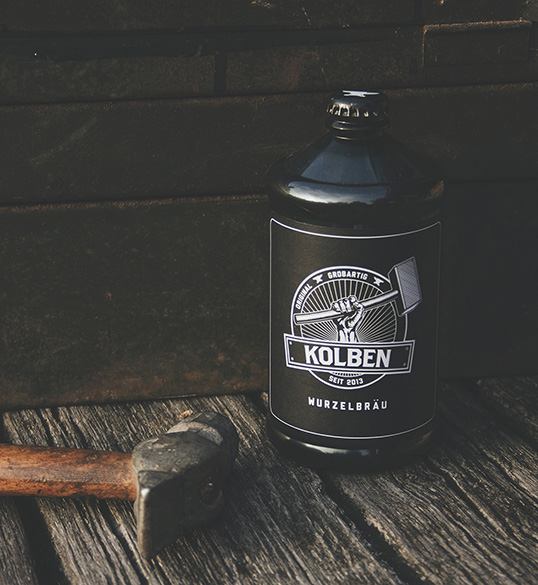
Designed by Marcel Messner | Country: Germany “Honest, authentic, strong – that’s KOLBEN, a real beer for real men. It’s the perfect refreshment after you spent
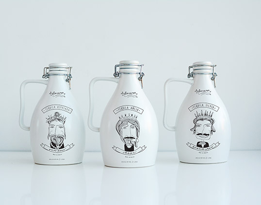
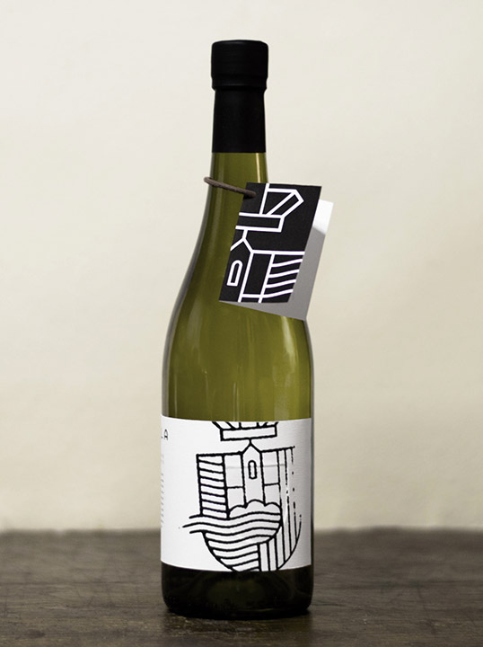
Designed by Kata Moravszki & Richárd Lakosi | Country: Hungary “The Figula winery vineyards are located at Balatonfüred and its sounding places. One such place is
Designed by Brennan Gleason | Country: Canada “This self directed student project for my final semester of design school was initiated with the goal in mind
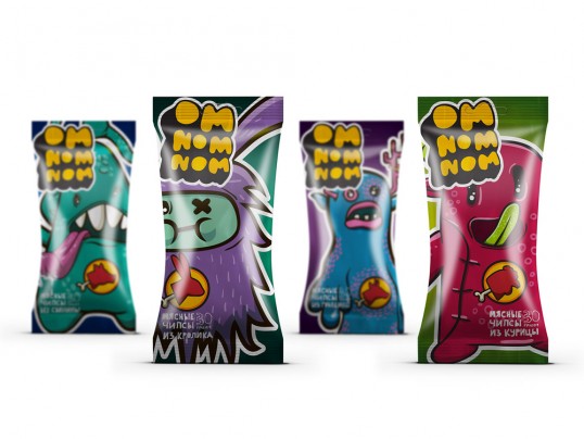
Designed by Anastasia Ovsyannikova | Country: Russia “Packaging of meat chips for teens. The flavor lineup includes: pork, beef, chicken and rabbit. It’s a fancy and