Designed by: PepsiCo Design & Innovation
Country: United States

Charles Worthington

Charles Worthington

Designed by Cookchick | Country: United Kingdom

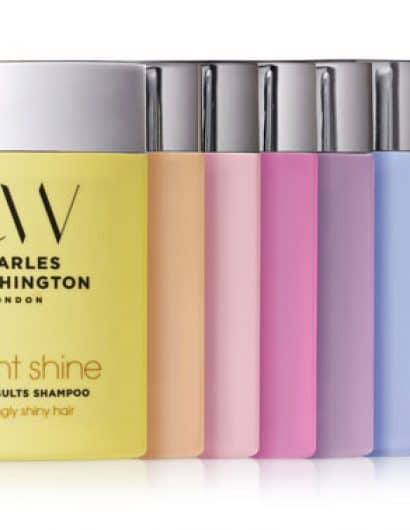
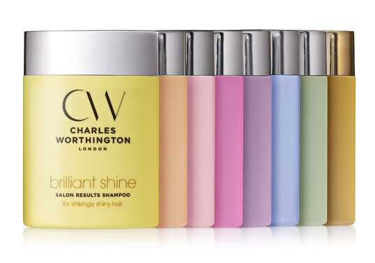
CookChick successfully won a 3 way pitch to secure the re-design project for the whole Charles Worthington Results range in September 2009. The Results range includes Shampoo & Conditioner products over 8 ‘regimes’ along with a full range of styling products and hair intensive solutions. The brand occupies a number two positioning in the professional hair care market.

The main objective of the brief was to regain a confident simplicity to the identity and packaging whilst increasing the premium positioning for the brand in an ultra competitive and increasingly noisy market. The starting point was the Charles Worthington brand identity. CookChick developed an idea from Charles himself by using just the CW letters and creating a cut-sharp brand mark. Coupled with the brand mark is a stripped back approach to the regime naming and descriptive copy. Each Regime has a clear, to the point, hair benefit USP and carries a hotspot of colour. It was agreed early on that the Charles Worthington bottle shape was unique and still carried a real point of difference on shelf. However, the new pastel & foil silver colour palette replaces the previous translucent plastic approach suggesting a more premium and sophisticated range.

The attention to detail was a critical aspect throughout this project. One example of this was adding a tactile CW logo embossing to the recessed thumb button on the lid. The overall impression in-store gives a fresh, bright & sophisticated brand feel coupled with immediate product benefit navigation.”

Charles Worthington

Get the latest packaging design inspiration in your inbox:

Popular designs

Motivational Sock Packaging: A Good Start to Your Day

Discover ‘Good Start’, a new sock brand designed to motivate. Each pack contains seven pairs of socks, each adorned with motivational quotes from famous personalities, intended to inspire a positive start to the day.

Harry Brompton’s Iced Tea Unveils New Packaging Design by Gency

Discover the vibrant new look of Harry Brompton’s Iced Tea, masterfully redesigned by Gency, and taste the summer with the introduction of their refreshing new Summer Berries flavour. Dive into a world where design meets deliciousness and experience the finest RTD tea.

Rebranding Mayawell: A Blend of Mexican Heritage and Healthy Living

Discover Mayawell, a Mexican-owned beverage company that celebrates its heritage with natural, organic, and prebiotic drinks. The rebranding strikes a balance between traditional elements and contemporary design, offering a unique, healthy alternative to traditional sodas.

Designed by: PepsiCo Design & Innovation
Country: United States

Charles Worthington

charlesworthington

Charles Worthington

Designed by Cookchick | Country: United Kingdom

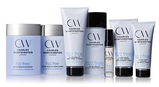
CookChick successfully won a 3 way pitch to secure the re-design project for the whole Charles Worthington Results range in September 2009. The Results range includes Shampoo & Conditioner products over 8 ‘regimes’ along with a full range of styling products and hair intensive solutions. The brand occupies a number two positioning in the professional hair care market.

The main objective of the brief was to regain a confident simplicity to the identity and packaging whilst increasing the premium positioning for the brand in an ultra competitive and increasingly noisy market. The starting point was the Charles Worthington brand identity. CookChick developed an idea from Charles himself by using just the CW letters and creating a cut-sharp brand mark. Coupled with the brand mark is a stripped back approach to the regime naming and descriptive copy. Each Regime has a clear, to the point, hair benefit USP and carries a hotspot of colour. It was agreed early on that the Charles Worthington bottle shape was unique and still carried a real point of difference on shelf. However, the new pastel & foil silver colour palette replaces the previous translucent plastic approach suggesting a more premium and sophisticated range.

The attention to detail was a critical aspect throughout this project. One example of this was adding a tactile CW logo embossing to the recessed thumb button on the lid. The overall impression in-store gives a fresh, bright & sophisticated brand feel coupled with immediate product benefit navigation.”
Charles Worthington

Previous slide
Next slide
Get the latest on packaging design in your inbox: