Designed by Blast | Country: United Kingdom
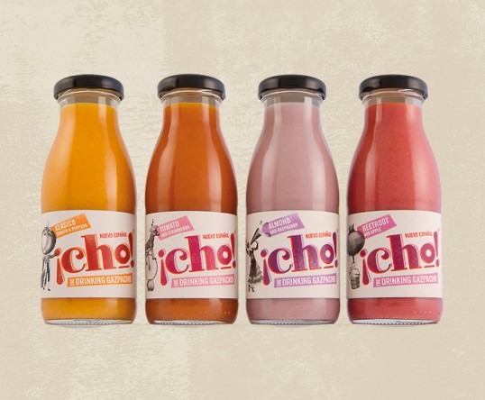
“¡Cho! is a completely unique range of on-the-go drinking Gazpacho recently launched to the UK market. Created by English entrepreneurs and a Michelin starred Spanish chef ¡Cho! is made from organic fruit and vegetables sourced and bottled in Adalucia.
¡Cho! needed to be positioned as a completely different product, and in doing so create its own place in the market. It required a brand identity that communicated a uniquely daring and different gourmet product with real provenance and exquisite taste.”

“Our brand concept ‘The Gazpacho Revolution’ projects the brand’s essence – a Spanish classic with a modern twist. The concept has an attitude which reflects ¡Cho’s character and provides a campaignable call to arms which can be used across all marketing and advertising channels to spread the word virally.”

“Visually the brand reflects the spontaneity and style of revolutionary typography. To further communicate a product of difference we created a series of Dada-esque illustrations which give personality to each individual flavour and reflect the uniquely different proposition of the brand.”

“¡Cho! was launched to high acclaim at the International Food Expo in London Docklands, promoted by a series of promotional materials including a manifesto-style newspaper. In the absence of a large advertising and marketing budget the brand concept harnessed the power of social media to spread the word on Facebook and Twitter – ‘Join the Gazpacho Revolution’.”