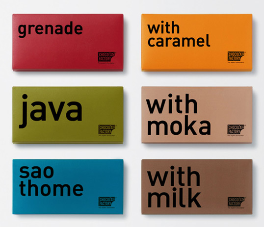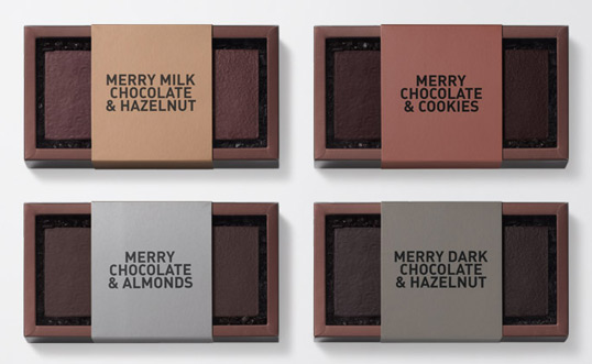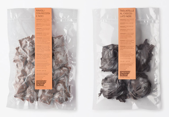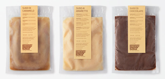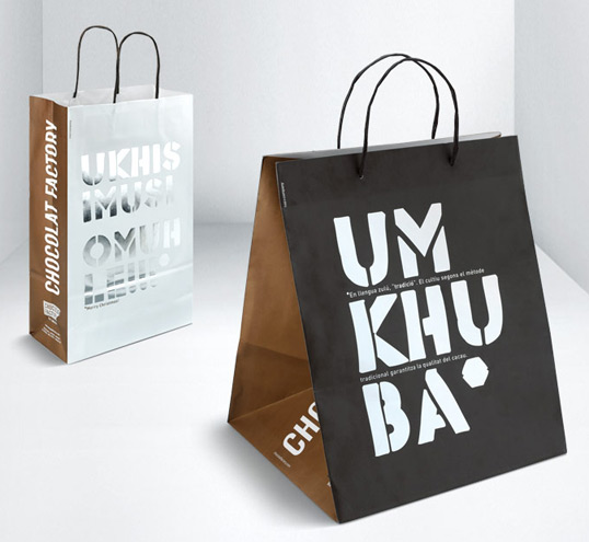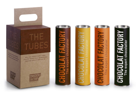
Designed by Ruiz+Company | Country: Spain
“The fact that the company’s founding partners are, respectively, an architect and an interior decorator, has probably exercised a decisive influence in this sensitive approach to design. As Michel Laline himself explains: “When we first launched the company, we realised that no one had used design in the sector as yet, so that formed the base of the business: chocolate and design.” And according to Titus Ruiz: “The concept of the brand was very clear from the start: design with content.”
Forming part of the company’s DNA from the first, then, design enabled them to give shape to the new business concept they wanted to launch onto the market, whilst it now helps them to transmit messages and to communicate new products to their customers. Design has been crucial in making the founders’ business vision a reality and today plays a fundamental role in defining Chocolat Factory customers’ experience of purchasing and consuming chocolate.
Design enables them to position their product in a market segment which has little to do with price competition and is much more concerned with communicating the company’s values and personality to the consumer.
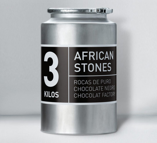
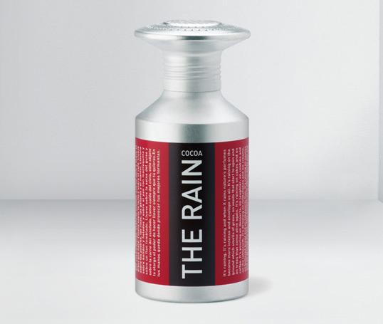
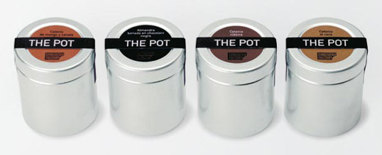
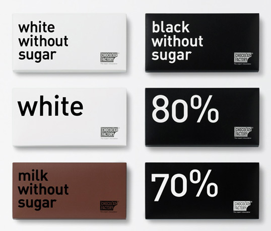
The brand’s strength lies largely in its graphic identity. Chocolat Factory has created a highly defined line that clearly identifies the company’s products, differentiating them from their most direct competitors. However, this does not mean that the Chocolat Factory logo is always present in a highly visible way on all products; on the latest packaging, the company name is practically hidden or at least occupies a secondary place in terms of importance. Consumers are already highly familiar with the brand, and this leaves the company free to focus graphic communication on the message. More and more, the fact that the company distributes its products in its own shops, thus neatly contextualizing them, facilitates this approach.”
