Designed by: PepsiCo Design & Innovation
Country: United States

Claridge’s Hotel

Claridge's Hotel

Designed by Construct | Country: United Kingdom

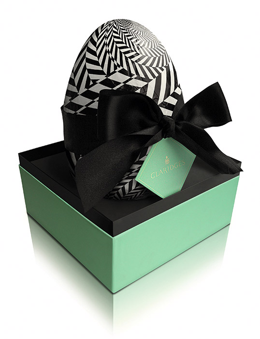
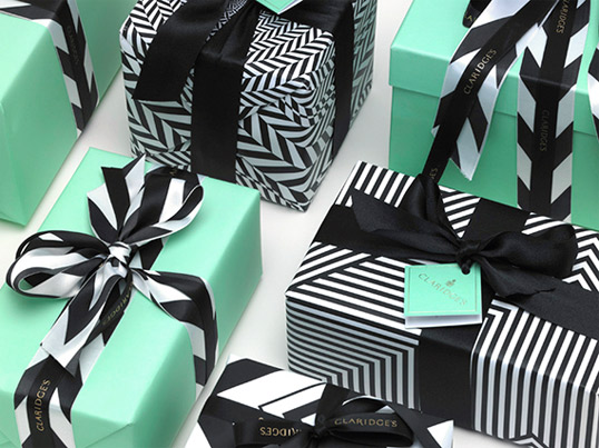
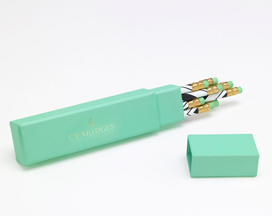
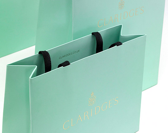
“London design studio Construct has given the branding of London’s famous Claridge’s hotel a thorough overhaul. Because it is a working hotel with a huge number of items traditionally branded (from teapots and egg cups through to slippers and dressing gowns), Construct’s task of not just branding, but implementing a consistent and cohesive sense of identity throughout the hotel and the objects within it was by no means straightforward. In fact, the rollout of the new branding is ongoing throughout this year as there are so many different ideas to implement across a huge range of items.

As well as introducing a sophisticated colour palette of jade, gold, white and black, bold architecturally inspired chevron patterns appear on the inside of bags, envelopes and on various objects, publications and goodies guests at the hotel are lilkely to encounter.”

Claridge's Hotel

Claridge's Hotel

Claridge's Hotel

Claridge's Hotel

via Creative Review

Get the latest packaging design inspiration in your inbox:

Popular designs

Inverey: A Unique Barrel-Aged Scottish Gin Packaging Design

Inverey stands out with its image that captures the essence of the rugged Highland countryside. Breaking away from the norm, the label design does not feature the traditional tartan. Instead, it presents an organised structure of intertwining circles, rhombuses, four-pointed stars and dots born out of their intersection.

Rebranding Mayawell: A Blend of Mexican Heritage and Healthy Living

Discover Mayawell, a Mexican-owned beverage company that celebrates its heritage with natural, organic, and prebiotic drinks. The rebranding strikes a balance between traditional elements and contemporary design, offering a unique, healthy alternative to traditional sodas.

Designed by: PepsiCo Design & Innovation
Country: United States

Claridge’s Hotel

clar

Claridge's Hotel

Designed by Construct | Country: United Kingdom

“London design studio Construct has given the branding of London’s famous Claridge’s hotel a thorough overhaul. Because it is a working hotel with a huge number of items traditionally branded (from teapots and egg cups through to slippers and dressing gowns), Construct’s task of not just branding, but implementing a consistent and cohesive sense of identity throughout the hotel and the objects within it was by no means straightforward. In fact, the rollout of the new branding is ongoing throughout this year as there are so many different ideas to implement across a huge range of items.

As well as introducing a sophisticated colour palette of jade, gold, white and black, bold architecturally inspired chevron patterns appear on the inside of bags, envelopes and on various objects, publications and goodies guests at the hotel are lilkely to encounter.”

Claridge's Hotel

Claridge's Hotel

Claridge's Hotel

Claridge's Hotel

via Creative Review

Previous slide
Next slide
Get the latest on packaging design in your inbox: