Designed by: PepsiCo Design & Innovation
Country: United States

COMOTÚ Fragrances

2

comotu1

Designed by Lavernia & Cienfuegos | Country: Spain

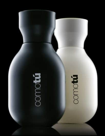
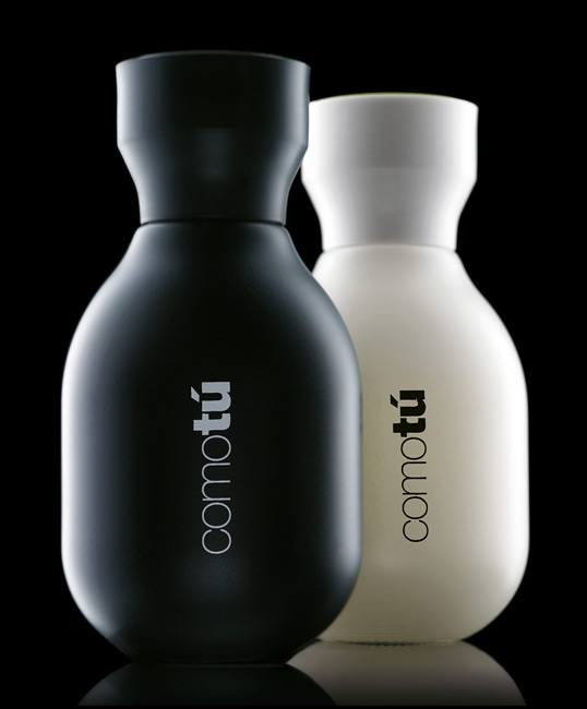
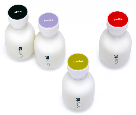
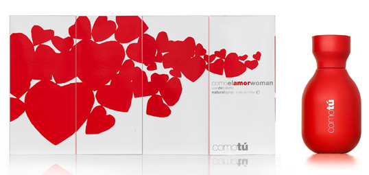
“The collection of mass-market fragrances COMOTÚ, designed for Mercadona, was aimed to be a simple product, in harmony with its price, but with a surprising presentation. In order to achieve a good brand image and minimize the costs of production, only one bottle design was used for the eight different fragrances, four in black for men and four in white for women. The distinct fragrances can be differentiated thanks to the different colours of their tops.

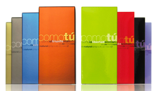
The shape of the bottle is rounded and curved, and the packages show shiny and metallic colours.
The final design both of the bottle and its package has the gift to transmit high quality and modernity at a competitive price. It proves that a mass-market product with a good design can be very successful.”
comotu2

comotu3

comotu4

comotu5

2

Get the latest packaging design inspiration in your inbox:

Popular designs

Over the wave

This Kombucha originates in Lombok, Indonesia, where its paradise beaches attract hundreds of surfers eager to ride the waves. When you surf,

Pure Persian Honey

When we look closely at honey packaging, they are almost all in the usual format, and the ultimate in creativity is that

Far Out Bar

Description: Far Out Bar is a cutting-edge packaging design project created for High Life Farms’ macrodose THC chocolate bars. This project involved

Designed by: PepsiCo Design & Innovation
Country: United States

COMOTÚ Fragrances

2
comotu1

comotu1

Designed by Lavernia & Cienfuegos | Country: Spain

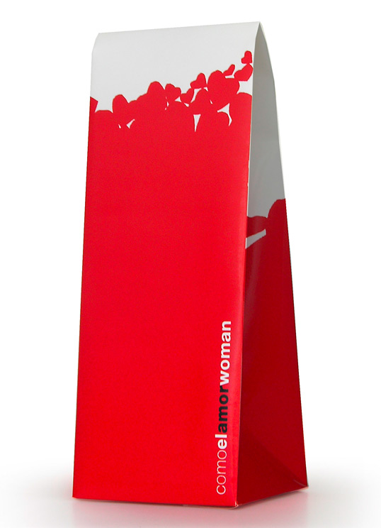
“The collection of mass-market fragrances COMOTÚ, designed for Mercadona, was aimed to be a simple product, in harmony with its price, but with a surprising presentation. In order to achieve a good brand image and minimize the costs of production, only one bottle design was used for the eight different fragrances, four in black for men and four in white for women. The distinct fragrances can be differentiated thanks to the different colours of their tops.

The shape of the bottle is rounded and curved, and the packages show shiny and metallic colours.
The final design both of the bottle and its package has the gift to transmit high quality and modernity at a competitive price. It proves that a mass-market product with a good design can be very successful.”
comotu2

comotu3

comotu4

comotu5

2
Previous slide
Next slide

Explore more great package design

Get the latest on packaging design in your inbox: