Crown Maple Syrup
June 14, 2011 | 7 Comments
Designed by Studio MPLS | Country: United States
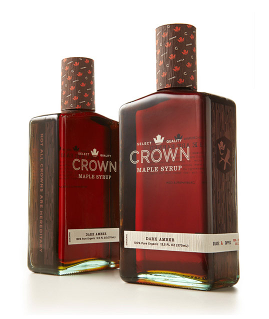
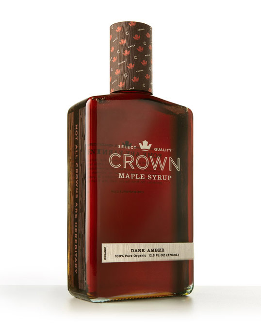
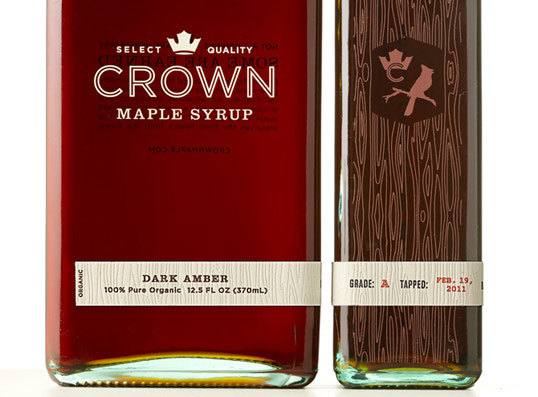
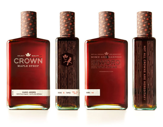
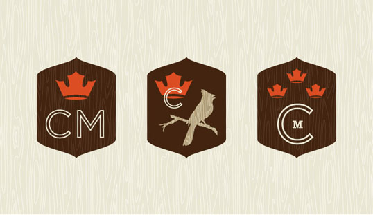
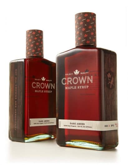
“Studio MPLS created a distinctive brand identity and visual brand language for the world’s first brand of super-premium maple syrup. Evoking the natural elements that abound in the majestic stands of Crown Maple sugar maples, the brand communicates the fusion of natural goodness of the real maple syrup and the sophisticated state of art production techniques that make it the purest maple syrup on earth. Graphic iconography influenced concept package design, secondary packaging, and collateral.”
Comments
7 Responses to “Crown Maple Syrup”
Your Comment
June 15th, 2011 @ 9:06 am
this is GORGEOUS. loe the wood tones.
June 15th, 2011 @ 9:25 am
yum !!!
June 15th, 2011 @ 12:28 pm
Precious!!!
June 16th, 2011 @ 3:52 am
outstanding.
June 16th, 2011 @ 2:43 pm
I like the graphic design, but I must say at first glance I thought it was whiskey(or bourbon). I think it’s just the shape of the bottle. But over all, very nice!
August 23rd, 2011 @ 12:04 pm
Really like the packaging. It definitely looks premium. But UGH, why does it have to be grade A? Grade B or bust, I say.
February 24th, 2012 @ 9:40 am
This packaging is soooo hot I wouldn’t hesitate to drink this shit straight out the bottle. Studio MPLS absolutely killed it!