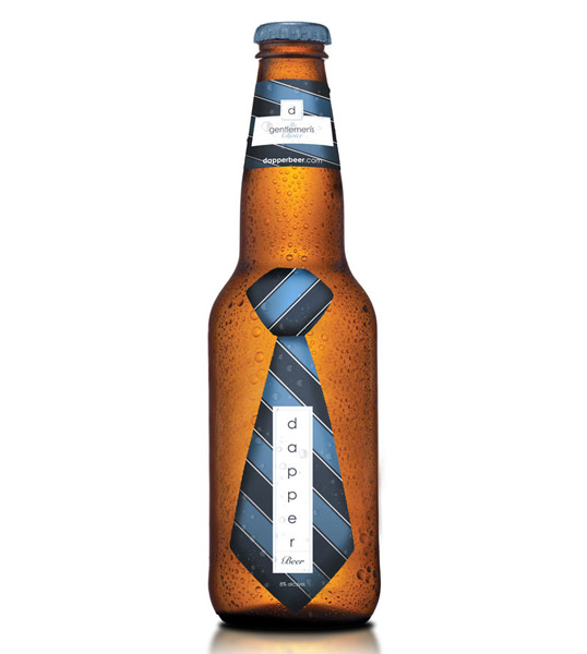
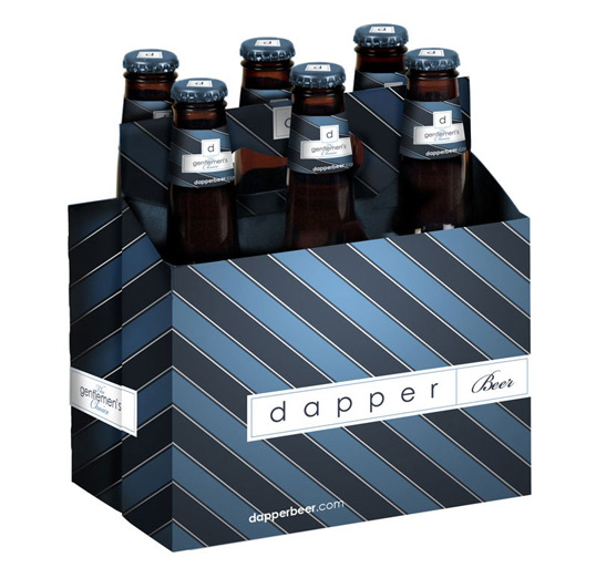
Dapper Beer
April 20, 2010 | 12 Comments
Designed by dd|a | Country: United States
“We at dd|a are brand zealots and proud of it. There’s no brand half full or brand half empty here; our brand cup overfloweth. Indeed, we have even been brewing our own homebrew, “dapper beer”. Dapper Beer is dd|a’s own packaging done for our fine brit co-worker.”
Comments
Warning: count(): Parameter must be an array or an object that implements Countable in /nfs/c02/h06/mnt/28959/domains/lovelypackage.com/html/wp-includes/class-wp-comment-query.php on line 399
12 Responses to “Dapper Beer”
Your Comment
April 20th, 2010 @ 12:51 pm
haha… like the idea.
April 20th, 2010 @ 1:33 pm
dapper is something that i don’t wish my beer to be, my beer should have slightly rough unpredictable manly qualities but each to there own
This would be perfect for something with tonic in.
April 20th, 2010 @ 7:38 pm
This is special. Like that
April 20th, 2010 @ 7:42 pm
Blue doesn’t compliment food, and that includes beer..
April 20th, 2010 @ 10:18 pm
great idea …
April 21st, 2010 @ 1:33 am
very creative approach – love it!
April 21st, 2010 @ 4:55 pm
ew.
absolutely dumb.
seems like a quirky, fun idea to doodle on a napkin or sketchpad while brainstorming / but should never have made it from sketch to computer.
there is nothing creative about it … poor typography and bad color choice.
April 21st, 2010 @ 8:14 pm
and what have you done Mr. Dela Rosa? I think it is a great concept!
April 22nd, 2010 @ 11:01 am
hmmm.
what have I done?
I’ve done my fair share.
and I know good, well-executed design when I see it.
May 1st, 2010 @ 9:48 am
Is beer, DONALD DRAPER gentleman from MAD MAN right? Who says the blue is not food, should never made it from sketch to computer? FOLKS free your mind, is just a beer, and u are supposed to be the creative thinkers, forget about old times limits, there are no limits, just false beliefs. According to my personal taste, it is bit cold, but definitely a LIKE and thumb up, because is not cliche. Well done.
May 1st, 2010 @ 10:44 am
No matter what someone has designed they are still entitled to an opinion.
For me I see blue used a lot on cheap own brand beer, and so blue on beer to me means cheap rubbish. That however looks like a premium brand.
I think it would be a little better using slightly different colours.
July 26th, 2010 @ 10:10 am
Hi mate, love the bottle. Possibly a bit too much over the edge on the six-pack, I’d love to see a office full of working beer bottles with ties on that one but lovely design on the bottle.