Designed by: PepsiCo Design & Innovation
Country: United States

Delhaize Soup

Delhaize Soup

Designed by Lavernia & Cienfuegos | Country: Spain

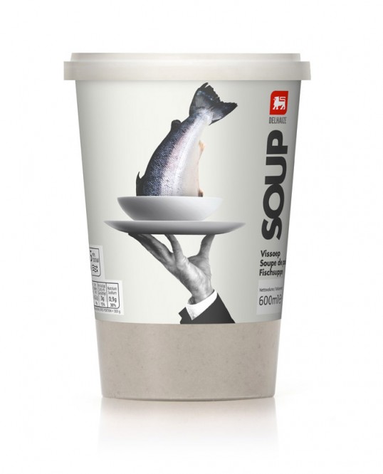
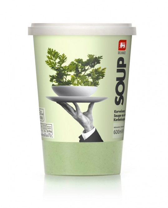
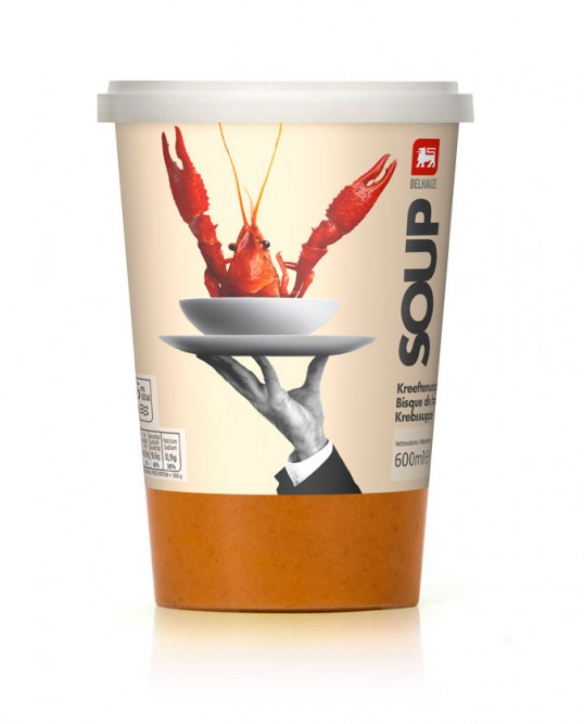
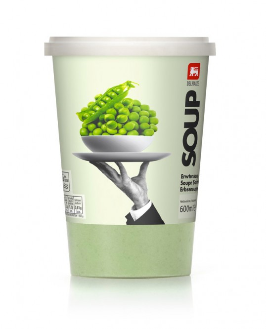
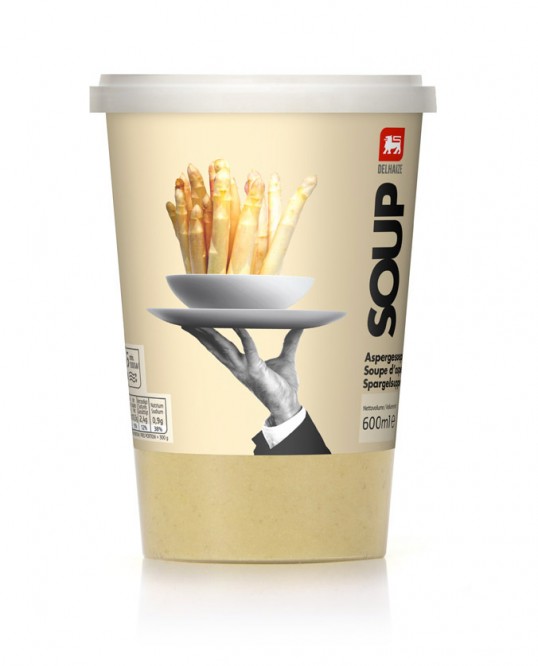
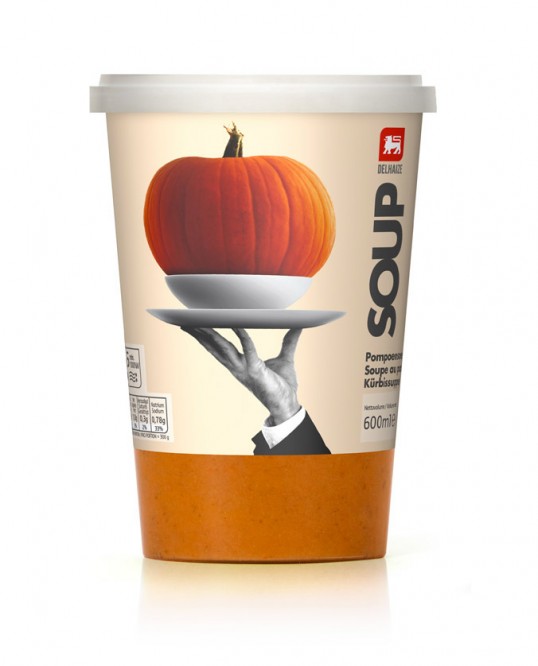
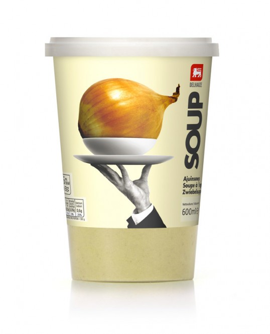
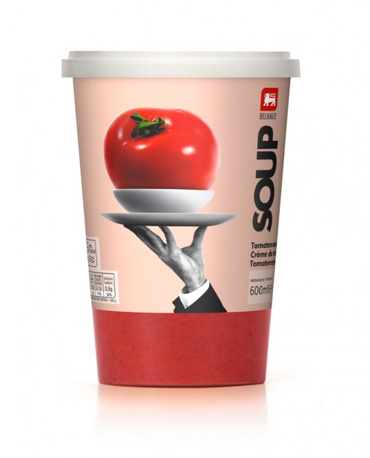
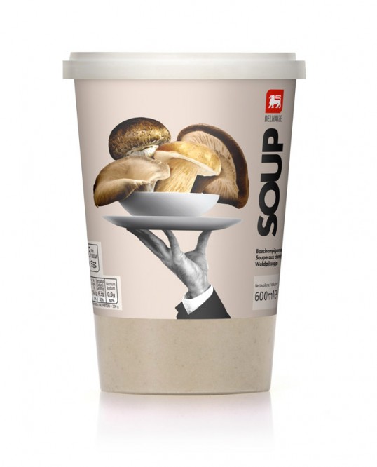
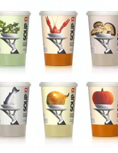
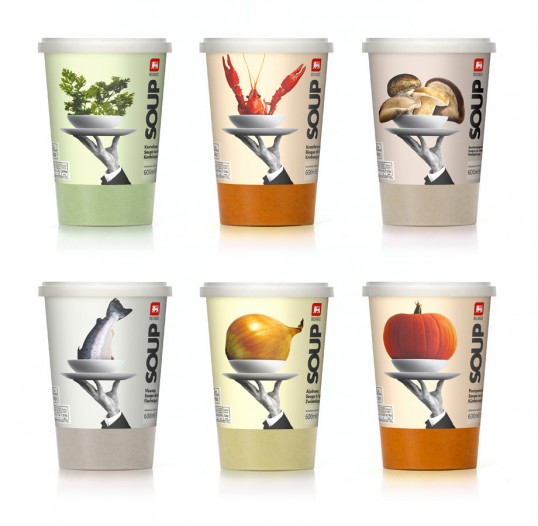
“The brief was to bring to life the principle ingredient, preferably through the use photo-realistic images, with something that adds a touch of good humor before serving. 

The romantic image of the waiter’s hands gives positive connotations of good service and quality. The steady black and white photography helps to visually unify the whole range, which is complimented by use of simple bold typography to balance the design. The size of the ingredients, in colour,  have been exaggerated in relation to the plate to emphasise the high natural vegetable content of the soups in comparison to its competitor’s. This play on size coupled with the waiter concept adds the touch of humor. Bon appétit!”

Delhaize Soup

Delhaize Soup

Delhaize Soup

Delhaize Soup

Delhaize Soup

Delhaize Soup

Delhaize Soup

Delhaize Soup

Delhaize Soup

Delhaize Soup

Delhaize Soup

Get the latest packaging design inspiration in your inbox:

Popular designs

The Port Vodka Lemon Water

Overview: In response to my client’s vision for a Cape Cod themed beverage brand, I embarked on the journey to create The Port

Burma Love Rebrand

Love at First BiteAs an extension of the Burma Superstar restaurant in San Francisco, Burma Love Foods gives diners an opportunity to

The Bra Guru

Most women are wearing the wrong size bra and that is a fact. The Bra Guru® is the first and only professional

Designed by: PepsiCo Design & Innovation
Country: United States

Delhaize Soup

lovely-package-delhaize-soup-1

Delhaize Soup

Designed by Lavernia & Cienfuegos | Country: Spain

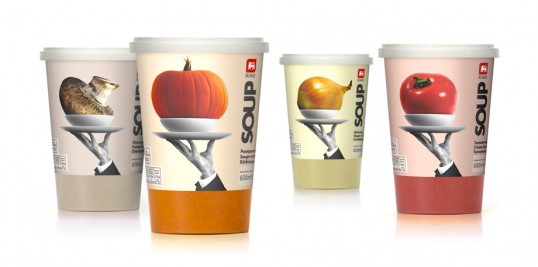
“The brief was to bring to life the principle ingredient, preferably through the use photo-realistic images, with something that adds a touch of good humor before serving. 

The romantic image of the waiter’s hands gives positive connotations of good service and quality. The steady black and white photography helps to visually unify the whole range, which is complimented by use of simple bold typography to balance the design. The size of the ingredients, in colour,  have been exaggerated in relation to the plate to emphasise the high natural vegetable content of the soups in comparison to its competitor’s. This play on size coupled with the waiter concept adds the touch of humor. Bon appétit!”
Delhaize Soup

Delhaize Soup

Delhaize Soup

Delhaize Soup

Delhaize Soup

Delhaize Soup

Delhaize Soup

Delhaize Soup

Delhaize Soup

Delhaize Soup

Delhaize Soup

Previous slide
Next slide

Explore more great package design

Get the latest on packaging design in your inbox: