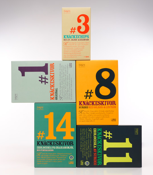
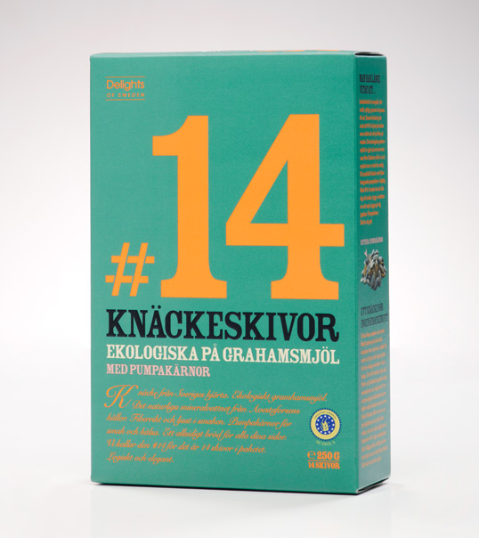
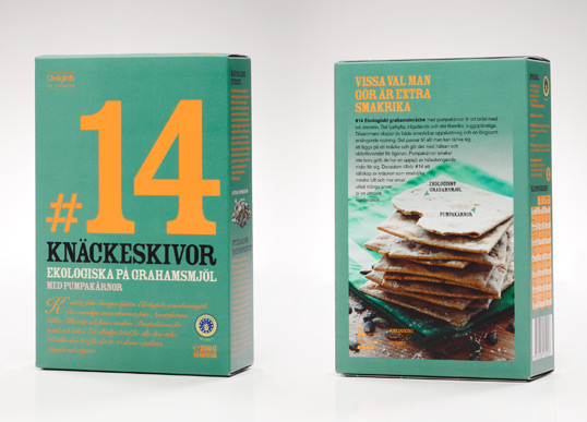
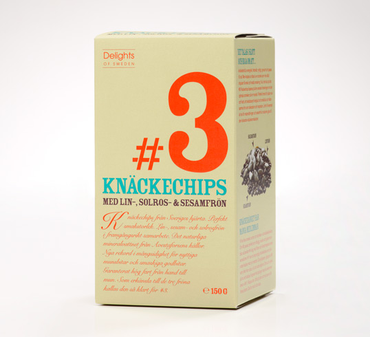
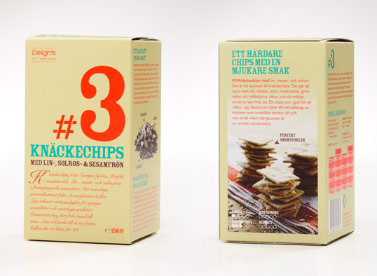
Designed by A-B-D | Country: Sweden | Fonts: Rosewood Fill, Snell Roundhand
“If you’ve got a crisp bread that actually’s got flavour, you’d be a fool not to put it in the heart of the brand strategy and packaging concept. So that’s exactly what design agency A-B-D did.
The task of creating a new brand in one of the most traditional categories in the Swedish food markets isn’t that easy. Especially not when the world leader is Swedish with nearly 70 % of the market and Swedes eat more crisp bread then any one else, making it as Swedish as IKEA and the traditional design nothing you muck about with.
We had a discussion about weather to just make a modernised version of the traditional design, but with a true challenger like this we had to make consumers take notice even if they weren’t looking. We had to puncture that autopilot that made them buy the same traditional woodlike flavourless bread every day and focus on the core idea of the product. The flavor. Says Design Director and founder Fredrik Bengtsson
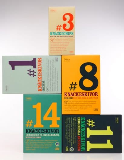
Instead of making a coherent brand name for the different flavours A-B-D therefore made the flavour the most prominent part of the packaging. Brand recognition thereby is based not on the company name but by the bold numbers on the front of the packaging, which automatically puts the flavour at the core of the brand. This need to stand out is also evident in the colours that create a rainbow on the shelves.
The brand isn’t just about the numbers and the colours. We’ve also worked a lot with the tone of voice creating different characters with their own story related to each flavour. We want people to smile when they pick it up. Put a little heart in to it and make it about something else than just the numbers, says Fredriks Bengtsson.”

