Designed by LOLA | Country: Spain
“2013 was a hard year in advertising. Bad news at lots of agencies and little reward. So, when Christmas came and the year was about to end, we wanted to make a nice gesture to our advertising colleagues: a present they could quietly enjoy, even on the worst nights.
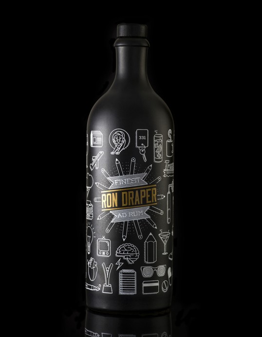
And so Ron Draper was born. A rum (“ron” in Spanish) to remind us that even if the ideas are drying up, the clients aren’t taking risks or the budgets are getting smaller, things can always be better. Because they were before. In the golden age of advertising.”


“That’s why we chose alcohol, so typical in the agencies at the time. And not just any alcohol, but a golden Reserve rum in honor of this golden age. With a color palette black, white and gold, representing the respect the industry had for creative people during that period.
And whats more, bottled with a minimalistic icon design, featuring all the things that made those years the best years in advertising history.”
Ron Draper isn’t about Mad Men. That’s why we didn’t include any cues to the show’s style in the design. It’s more about that golden age of advertising, when things were better.”