Designed by: PepsiCo Design & Innovation
Country: United States

Doritos Concept

doritos1

Designed by Petar Pavlov | Country: Macedonia

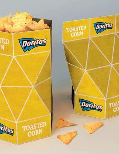
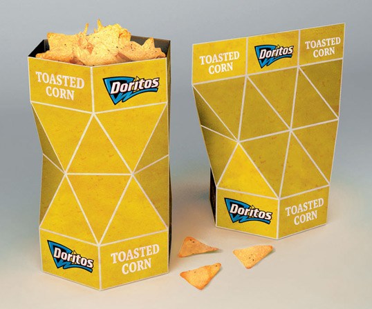
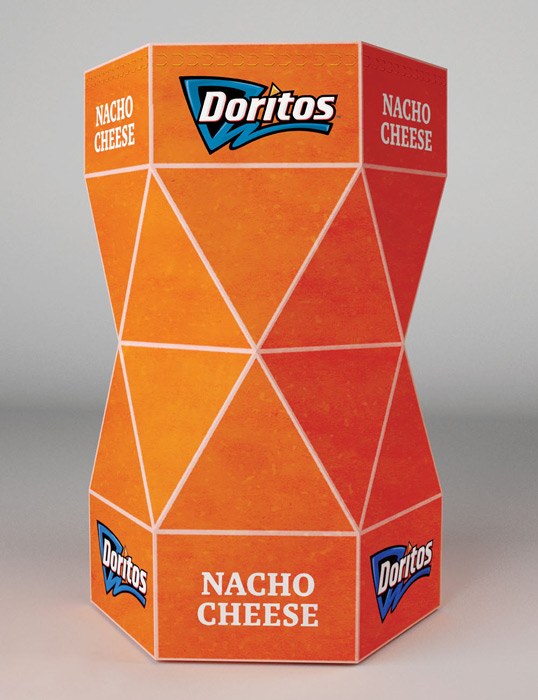
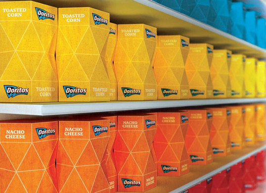
“This project was based on one of the YCN briefs where they asked from designers to create a totally new packaging concept for Doritos. Unfortunately, when I saw the brief the deadline was very close, but nevertheless I developed it. The shape and the texture of the Doritos chips are used as the base of this packaging concept.”
doritos2

doritos3

“What’s good about the form of the packaging is its structure which can keep the chips closed after opening. Below you can see a scaled-down model of how this works.”
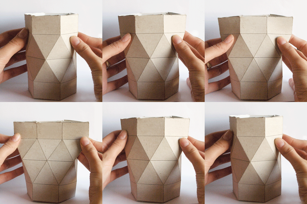
821171254064077

“Currently I’m developing illustrations which can replace the textured solid colors. I also invite every designer interested in collaboration to create illustrations of his own. I have prepared a template which you can download it below. I would like to see what you will come up with. Feel free to post solutions to this Facebook group.
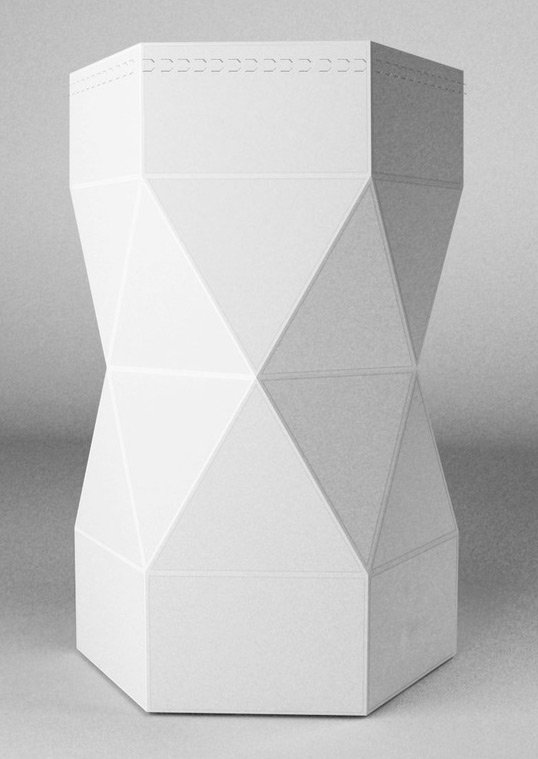
doritos4

Get the latest packaging design inspiration in your inbox:

Popular designs

The Port Vodka Lemon Water

Overview: In response to my client’s vision for a Cape Cod themed beverage brand, I embarked on the journey to create The Port

Over the wave

This Kombucha originates in Lombok, Indonesia, where its paradise beaches attract hundreds of surfers eager to ride the waves. When you surf,

Far Out Bar

Description: Far Out Bar is a cutting-edge packaging design project created for High Life Farms’ macrodose THC chocolate bars. This project involved

Pure Persian Honey

When we look closely at honey packaging, they are almost all in the usual format, and the ultimate in creativity is that

Designed by: PepsiCo Design & Innovation
Country: United States

Doritos Concept

doritos1

doritos1

Designed by Petar Pavlov | Country: Macedonia

“This project was based on one of the YCN briefs where they asked from designers to create a totally new packaging concept for Doritos. Unfortunately, when I saw the brief the deadline was very close, but nevertheless I developed it. The shape and the texture of the Doritos chips are used as the base of this packaging concept.”

doritos2

doritos3

“What’s good about the form of the packaging is its structure which can keep the chips closed after opening. Below you can see a scaled-down model of how this works.”

821171254064077

“Currently I’m developing illustrations which can replace the textured solid colors. I also invite every designer interested in collaboration to create illustrations of his own. I have prepared a template which you can download it below. I would like to see what you will come up with. Feel free to post solutions to this Facebook group.

doritos4

Previous slide
Next slide

Explore more great package design

Get the latest on packaging design in your inbox: