Designed by Founded | Country: United Kingdom
“This work is something which we recently produced for Icon Magazine’s Rethink project. We were tasked with rethinking something we felt was in need of an overhaul. We focussed our attention up paint tins, and specifically the Dulux brand. Below is an excerpt from the interview for Icon Magazine:
Having recently braved the turmoil that is home decorating, the pain of standing in front of rows of souless tins of paint with no personality was fresh in the mind like a newly glossed skirting board. Therefore, when Icon’s ReThink brief landed, that feeling of being a frustrated paint consumer became the focus of our attention. When everyone thinks of paint (certainly in the UK) I’m sure they think of Dulux.”

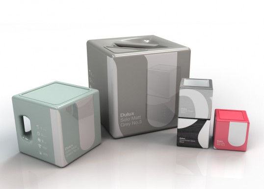
“We focused the majority of our attentions on packaging as this is the area we felt the greatest improvements could be suggested in a short space of time. The first thing you will notice is that our paint tins don’t look like paint tins. We’re sure there are many good reasons for keeping paint can’s circular (but we didn’t want that to spoil our fun) as there are some very good reasons to argue for changing paint tins to Cubes; reducing storage space and transport, and as a result reducing their environmental impact.”

“We wanted our design approach to offer a much stonger continuity between products and the different ranges on offer. The colour forms the majority of each package’s surface, making selection for the consumer much easier.The paint finish is also reflected in the packaging. Matt paint has a matt finish, Gloss has a gloss finish (you get the picture)… special paints would be represented by material textures, Metal, Wood, etc.
Using different crops of the logo, each paint or sub brand has it’s own individual look but are all quite clearly part of a bigger family. This helps achieve a greater on-shelf impact and brand awareness.”