ENOSIS
October 19, 2011 | 7 Comments
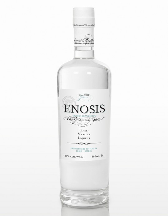
Designed by Dimitris Stefanidis | Country: Greece
“Simple Spirit! A white, classy label for a fine mastiha liqueur. The non-colour packaging inspires through simplicity, graphic weights and analogies. A touch of metallic turquoise brings everything into balance. ENOSIS in Greek means union. People under the same spirit, the same beliefs and care, gathered, inspired and created a unique spirit: the original mastiha liqueur.”
Comments
Warning: count(): Parameter must be an array or an object that implements Countable in /nfs/c02/h06/mnt/28959/domains/lovelypackage.com/html/wp-includes/class-wp-comment-query.php on line 399
7 Responses to “ENOSIS”
Your Comment
October 20th, 2011 @ 6:24 am
Wow. So graceful packaging
October 20th, 2011 @ 12:34 pm
proud to see my island’s liquer new packaging here!!! viva chios!!!
October 20th, 2011 @ 7:19 pm
Beautiful design/typography! What typeface did you use? I especially love the font used for “The Growers’ Spirit.
October 26th, 2011 @ 5:38 am
Full Credits as follow
Designed for mastihashop www.mastihashop.com/
by Dimitris Stefanidis at Looking Agency.
Copywriting by Smaro Politi.
November 19th, 2011 @ 3:41 pm
@ erma: That looks like Burgues Script. Would agree this is a superb font. http://new.myfonts.com/fonts/sudtipos/burgues-script/
March 6th, 2012 @ 2:52 am
@ Markus, you are perfectly right! đ
March 6th, 2012 @ 2:53 am
@ Ritz, Ria, Ema, thank you for your kind words!