Designed by: PepsiCo Design & Innovation
Country: United States

Estelle & Thild

Estelle & Thild

Designed by Dolhem Design | Country: Sweden | Fonts used: MeMimas, FF Scala Sans

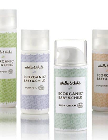
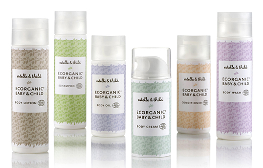
“Estelle & Thild ecorganic baby care provides the first Ecocert certified range of baby care products to the Swedish market. A playful yet clean Scandinavian manner was applied on the packaging to appeal to aware parents with young children.

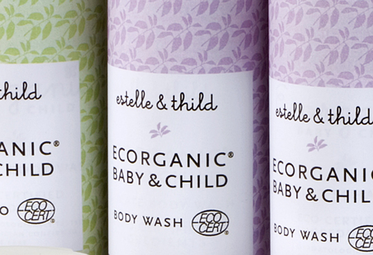
The pattern of avacado leaves reappears throughout the Estelle & Thild profile, not only on the packages, as avocado oil is one of the most frequently used ingredients in the range. The pattern also symbolizes the natural origin of the products. The products are differentiated from each other by the mild pastel colours, often associated with children’s products. Visually the product range stands out among its Swedish competitors.”
Estelle & Thild

Get the latest packaging design inspiration in your inbox:

Popular designs

Innovative Design and Packaging of Teeling Whiskey Crystal Malt

Explore the innovative packaging design of Teeling Whiskey Crystal Malt. A dark screen printed bottle with a Marque™ aluminum label, textural dimension, and a seamless diamond pattern, embodies the brand’s commitment to unconventional expressions.

Wanderers Vodka: A Blend of Nomadic Heritage and Modern Design

The spirit of freedom and adventure is encapsulated in the design of the Wanderers Vodka. Infused with steppe herbs, the complex flavor and unique aroma transport us straight to the vast plains of the Qazaqstan steppe, where nomad tribes traversed the land for thousands of years, shaping its history.

Designed by: PepsiCo Design & Innovation
Country: United States

Estelle & Thild

estelle1

Estelle & Thild

Designed by Dolhem Design | Country: Sweden | Fonts used: MeMimas, FF Scala Sans

“Estelle & Thild ecorganic baby care provides the first Ecocert certified range of baby care products to the Swedish market. A playful yet clean Scandinavian manner was applied on the packaging to appeal to aware parents with young children.

The pattern of avacado leaves reappears throughout the Estelle & Thild profile, not only on the packages, as avocado oil is one of the most frequently used ingredients in the range. The pattern also symbolizes the natural origin of the products. The products are differentiated from each other by the mild pastel colours, often associated with children’s products. Visually the product range stands out among its Swedish competitors.”

Estelle & Thild

Previous slide
Next slide
Get the latest on packaging design in your inbox: