Designed by Morse Studio | Country: United Kingdom
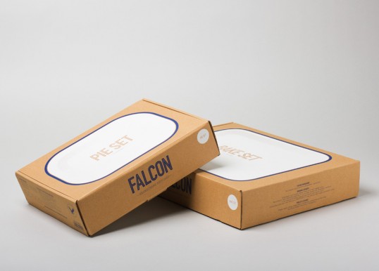
“Falcon Enamelware has been an icon of British home life since the 1920s. The classic kitchenware brand has been revitalised with a new brand identity and updated ranges by Morse Studio & Kiwi & Pom.
We were commissioned to create a new brand identity including logotype, packaging, art direction and e-commerce website design. Our identity rigourously references Falcon’s distinctive blue rim, from the creation of a bespoke, inline typeface to the overhead food photography. The packaging takes the same uncomplicated approach. Simple half-tone illustrations are screen-printed on sturdy corrugated cardboard referencing the utility and charm of hardware shop packaging. An updated ‘falcon in flight’ crest acts as a seal of authenticity on every product.”