Designed by: PepsiCo Design & Innovation
Country: United States

Fieldʼs Sweet Spot

sweetspot1

Designed by Wink | Country: United States | Fonts used: Futura, perhaps hand lettering (see MVB Grenadine).

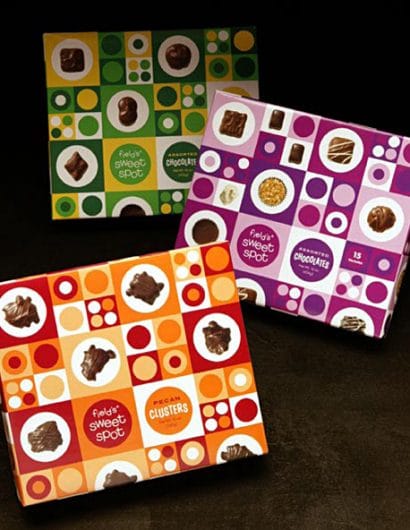
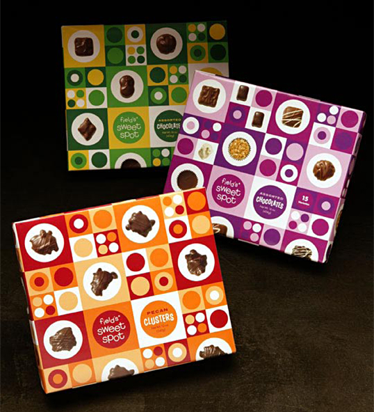
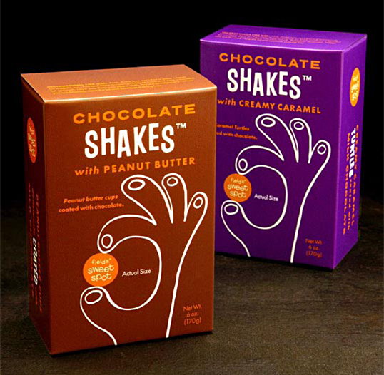
“Field’s Sweet Spot is a nostalgic candy destination of the Midwest department store Marshall Field’s. The vernacular (a nod to the mod ’60s) is equal parts fashion and fantasy, a concoction that combines both the department’s retro-candy product selection and fashion driven branding efforts of Marshall Field’s itself. The identity creates a playful aesthetic that appeals to both children and Marshall Field’s female core guest alike.”
sweetspot2

Get the latest packaging design inspiration in your inbox:

Popular designs

Burma Love Rebrand

Love at First BiteAs an extension of the Burma Superstar restaurant in San Francisco, Burma Love Foods gives diners an opportunity to

The Bra Guru

Most women are wearing the wrong size bra and that is a fact. The Bra Guru® is the first and only professional

Far Out Bar

Description: Far Out Bar is a cutting-edge packaging design project created for High Life Farms’ macrodose THC chocolate bars. This project involved

Designed by: PepsiCo Design & Innovation
Country: United States

Fieldʼs Sweet Spot

sweetspot1

sweetspot1

Designed by Wink | Country: United States | Fonts used: Futura, perhaps hand lettering (see MVB Grenadine).

“Field’s Sweet Spot is a nostalgic candy destination of the Midwest department store Marshall Field’s. The vernacular (a nod to the mod ’60s) is equal parts fashion and fantasy, a concoction that combines both the department’s retro-candy product selection and fashion driven branding efforts of Marshall Field’s itself. The identity creates a playful aesthetic that appeals to both children and Marshall Field’s female core guest alike.”

sweetspot2

Previous slide
Next slide

Explore more great package design

Get the latest on packaging design in your inbox: