Student Work – FIT
April 18, 2009 | 13 Comments
A few students in Package Design BFA who are studying at the Fashion Institute of Technology in New York sent us their work.
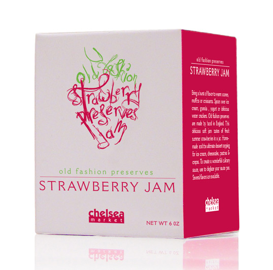
Designed by Emily Berry | Country: United States
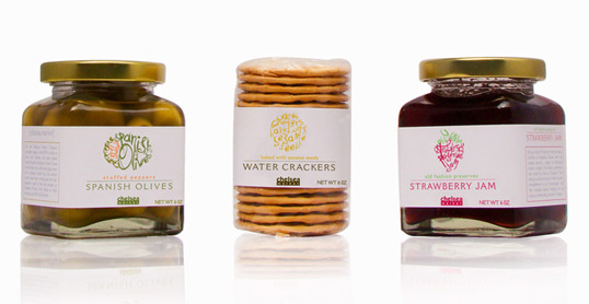
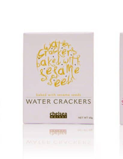
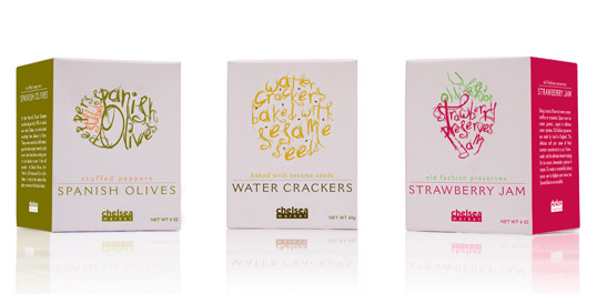
The project was to create a unique brand packaging identity that embodies New York’s Chelsea Market.
Chelsea Market consists of numerous retail elements blended to create a single entity. My package design reflects this concept by using individual letterforms of the various products to develop a single image of that product.
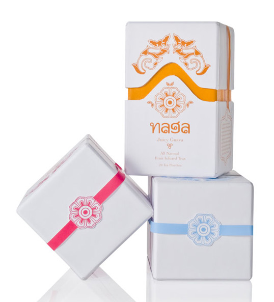
Designed by Cassie Garcia | Country: United States
“Naga Teas is a fresh line of exotic fruit infused teas originating from Thailand. The logo is very reminiscent of Thai writing, and I wanted to add little intricate details that add interest in the unwrapping of the package. The packaging is clean and the colors are bright and bold so that it has a presence on shelf in the tea category.”
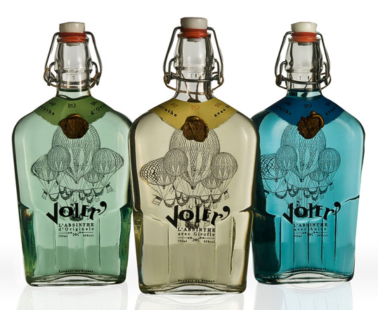
Designed by Eva Pieczynski | Country: United States
Voler means to fly in French and corresponds to the legendary hallucinogenic qualities of this Absinthe. In the peak of it’s popularity in the fin de siecle -the end of the 19th century it’s been the favorite splurge of artists residing in France and the rest of Europe.
The goal of the packaging for Voler was to create clean, distinct design however bringing to mind the era of artistic Paris of the end of 19th Century. Hence the flask like bottle with a swing top, hot air balloon, wax seal or traditional typography.
Comments
Warning: count(): Parameter must be an array or an object that implements Countable in /nfs/c02/h06/mnt/28959/domains/lovelypackage.com/html/wp-includes/class-wp-comment-query.php on line 399
13 Responses to “Student Work – FIT”
Your Comment
April 19th, 2009 @ 3:02 am
Nice work! Especially like the hand-drawn parts on Emily Berrys designs.
April 19th, 2009 @ 11:12 am
good stuff! Love how the hand-drawn typeface was used on the chelsea market … wish the secondary copy on it was a little bit more designed though.
….where’s the rest of the class? would’ve loved to see more!
April 19th, 2009 @ 11:42 am
You guys are awesome!
April 19th, 2009 @ 5:02 pm
Cute
April 19th, 2009 @ 6:35 pm
the first one’s nice. the next two are so-so. regardless, it’s always good to see student work.
the class can’t be made up of just 3 people. where’s the rest?
April 20th, 2009 @ 2:44 am
“old fashion preserves?”
Old FashionED preserves, surely?
Love the Voler design.
April 20th, 2009 @ 7:05 am
Lovely illustrations on the first piece. Rough yet classic. Not sure about the typo though.
April 20th, 2009 @ 4:02 pm
I’m pretty sure the company can call its product what it wants. Not a typo.
Olld Fashion Jams & Preserves
April 20th, 2009 @ 4:17 pm
Thanks everyone for the feedback. Although “old fashioned” is more commonly used, “old fashion” is not incorrect. Much like the use of “ice tea” and “iced tea”. But that is something I will consider changing to avoid any further confusion.
Thanks again,
Emily
April 20th, 2009 @ 9:35 pm
Something about the first piece floods my sense of nostalgia. Nice to see. “Old fashioned”, is just that; old fashioned, colloquial English. Either way, the copy is grammatically acceptable.
April 21st, 2009 @ 2:25 am
awesome work !
April 22nd, 2009 @ 7:31 am
Awesome typostrations Emily!
May 9th, 2009 @ 6:41 pm
Unfortunately, though the first piece is nice, its not handwritten.
I do believe its is a free font, called Jellyka Caste’s Queen.
http://www.dafont.com/jellyka-castles-queen.font
But great student work all the same.