Designed by: PepsiCo Design & Innovation
Country: United States

Freak

Freak

Designed by Propaganda | Country: United Kingdom

“As part of our ongoing work with the cult beauty brand Illamasqua, we have been heavily involved in the creation, development and launch of their first fragrance.  As a brand that celebrates the idiosyncrasy of people, being unique and out of the ordinary, Illamasqua adopted the name ‘Freak’ for the fragrance.

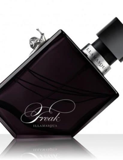
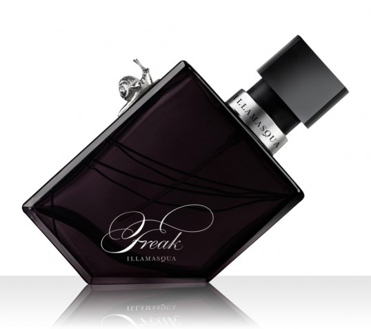
Given this as a basis, we explored a range of different avenues for what a ‘Freak’ bottle should look like. We decided on the bottle in the attached images. The shape is based on a traditional classic perfume bottle, with the bottom right corner removed to make the bottle stand on its edge, echoing the Freak ethos of ‘refusing to fit in’.

A silver snail is attached to its side, a snail being a creature that is perfectly formed yet not admired as being conventionally beautiful by the masses, this represents Illamasqua’s love of beauty in all things, especially the unconventional.

Illamsqua considers itself a night-time brand, therefore it makes sense that this unisex fragrance is made from flowers that bloom only at night, including the Queen of the Night (or Nightblooming Ceresus), a rare flower from the Arizonian desert which blooms for only night a year or when the moon is full.”

Get the latest packaging design inspiration in your inbox:

Popular designs

The Bra Guru

Most women are wearing the wrong size bra and that is a fact. The Bra Guru® is the first and only professional

The Port Vodka Lemon Water

Overview: In response to my client’s vision for a Cape Cod themed beverage brand, I embarked on the journey to create The Port

Pure Persian Honey

When we look closely at honey packaging, they are almost all in the usual format, and the ultimate in creativity is that

Designed by: PepsiCo Design & Innovation
Country: United States

Freak

lovely-package-freak

Freak

Designed by Propaganda | Country: United Kingdom

“As part of our ongoing work with the cult beauty brand Illamasqua, we have been heavily involved in the creation, development and launch of their first fragrance.  As a brand that celebrates the idiosyncrasy of people, being unique and out of the ordinary, Illamasqua adopted the name ‘Freak’ for the fragrance.

Given this as a basis, we explored a range of different avenues for what a ‘Freak’ bottle should look like. We decided on the bottle in the attached images. The shape is based on a traditional classic perfume bottle, with the bottom right corner removed to make the bottle stand on its edge, echoing the Freak ethos of ‘refusing to fit in’.

A silver snail is attached to its side, a snail being a creature that is perfectly formed yet not admired as being conventionally beautiful by the masses, this represents Illamasqua’s love of beauty in all things, especially the unconventional.

Illamsqua considers itself a night-time brand, therefore it makes sense that this unisex fragrance is made from flowers that bloom only at night, including the Queen of the Night (or Nightblooming Ceresus), a rare flower from the Arizonian desert which blooms for only night a year or when the moon is full.”

Explore more great package design

Get the latest on packaging design in your inbox: