Designed by: PepsiCo Design & Innovation
Country: United States

Garlic Jim’s

Garlic Jim’s

Designed by Hornall Anderson | Country: United States

“How does a brand shift preconceived consumer expectations, especially when it’s a gluten-free product typically considered lacking in taste? This was the challenge pizza franchise, Garlic Jim’s faced when launching their gluten-free pizza offering to a broader, in-store retail audience.

With an estimated 18 million people in the United States sensitive or allergic to gluten to some degree, Garlic Jim’s approached Seattle-based brand design firm Hornall Anderson to help them expand their already successful in franchise gluten-free pizza to frozen opportunities by venturing into grocery stores. With this new endeavor, they looked to Hornall Anderson to help them better communicate their point of difference with consumers and retailers alike.

Garlic Jim’s

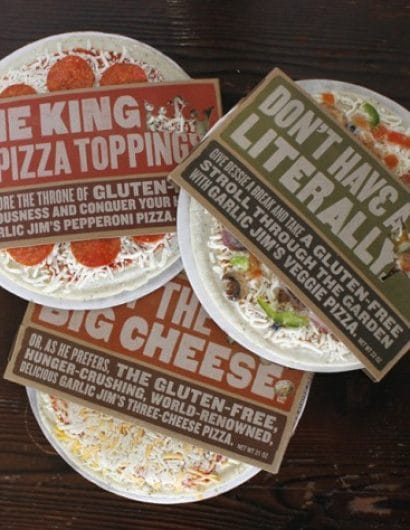
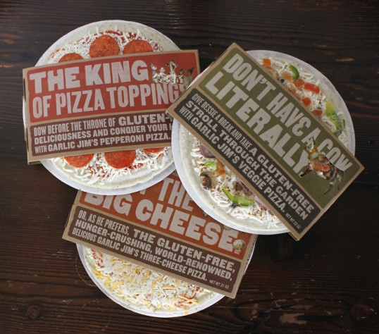
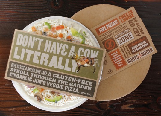
As one of the first gluten-free pizzas within mainstream retailers, Garlic Jim’s wanted to initiate a conversation with potential consumers on-shelf. Hornall Anderson took this direction and ran with it. Instead of doing the typical front of pack “beauty” shots of pizza that consumers are used to seeing when shopping the frozen pizza aisle, Hornall Anderson used an editorial tabloid-style approach on the packaging. Representing the “gluten-free movement” for those required and those choosing to make a healthier choice, the packaging design uses humorous slogans and tongue-in-cheek messaging that places emphasis on “owning” and “embracing” the gluten-free pizza, rather than being apologetic for it.

Already, feedback has been phenomenal. Consumers consider the new Garlic Jim’s frozen pizza a premium product, and retailers are excited about the growing sales,shifting Garlic Jim’s presence from experimental to mainstay in-store. With distribution currently localized in Western Washington, Garlic Jim’s is anticipating expansion of its frozen pizza into a larger regional rollout with hopes of expanding sales nationally.”

Get the latest packaging design inspiration in your inbox:

Popular designs

Burma Love Rebrand

Love at First BiteAs an extension of the Burma Superstar restaurant in San Francisco, Burma Love Foods gives diners an opportunity to

Far Out Bar

Description: Far Out Bar is a cutting-edge packaging design project created for High Life Farms’ macrodose THC chocolate bars. This project involved

Over the wave

This Kombucha originates in Lombok, Indonesia, where its paradise beaches attract hundreds of surfers eager to ride the waves. When you surf,

The Port Vodka Lemon Water

Overview: In response to my client’s vision for a Cape Cod themed beverage brand, I embarked on the journey to create The Port

Designed by: PepsiCo Design & Innovation
Country: United States

Garlic Jim’s

lovley-package-garlic-jims1

Garlic Jim’s

Designed by Hornall Anderson | Country: United States

“How does a brand shift preconceived consumer expectations, especially when it’s a gluten-free product typically considered lacking in taste? This was the challenge pizza franchise, Garlic Jim’s faced when launching their gluten-free pizza offering to a broader, in-store retail audience.

With an estimated 18 million people in the United States sensitive or allergic to gluten to some degree, Garlic Jim’s approached Seattle-based brand design firm Hornall Anderson to help them expand their already successful in franchise gluten-free pizza to frozen opportunities by venturing into grocery stores. With this new endeavor, they looked to Hornall Anderson to help them better communicate their point of difference with consumers and retailers alike.

Garlic Jim’s

As one of the first gluten-free pizzas within mainstream retailers, Garlic Jim’s wanted to initiate a conversation with potential consumers on-shelf. Hornall Anderson took this direction and ran with it. Instead of doing the typical front of pack “beauty” shots of pizza that consumers are used to seeing when shopping the frozen pizza aisle, Hornall Anderson used an editorial tabloid-style approach on the packaging. Representing the “gluten-free movement” for those required and those choosing to make a healthier choice, the packaging design uses humorous slogans and tongue-in-cheek messaging that places emphasis on “owning” and “embracing” the gluten-free pizza, rather than being apologetic for it.

Already, feedback has been phenomenal. Consumers consider the new Garlic Jim’s frozen pizza a premium product, and retailers are excited about the growing sales,shifting Garlic Jim’s presence from experimental to mainstay in-store. With distribution currently localized in Western Washington, Garlic Jim’s is anticipating expansion of its frozen pizza into a larger regional rollout with hopes of expanding sales nationally.”
Previous slide
Next slide

Explore more great package design

Get the latest on packaging design in your inbox: