Designed by: PepsiCo Design & Innovation
Country: United States

Guinness Draught

guinness

Designed by jkr | Country: United Kingdom

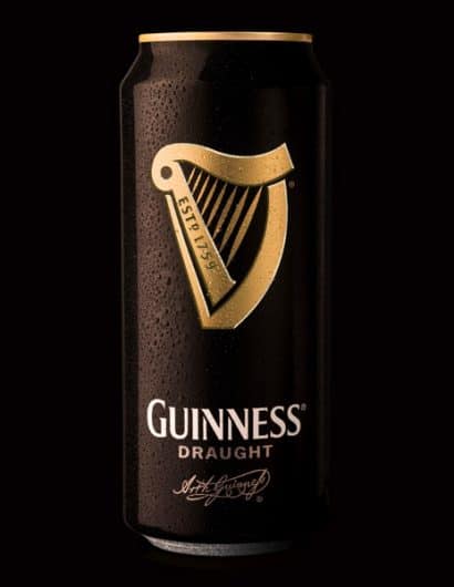
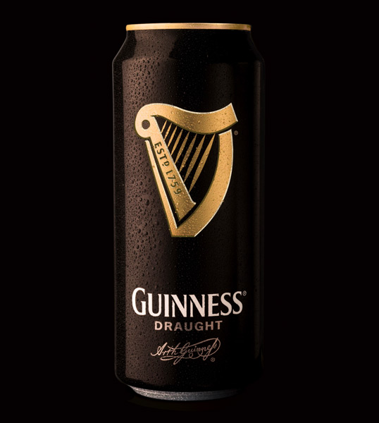
I’ve always been a fan of Guinness’ clean and simple design, a look that stands out amongst the plethora of offerings within the beer market. To coincide with the 250th anniversary (250 years!) of the brand, jkr has made an already great design even better.

“On this historic day 250 years ago Arthur Guinness signed the lease on his Dublin brewery. Today this will be celebrated by the brand on a global level with parties, charitable funds and special packaging all part of the mix*.

This week also sees the launch of overhauled packaging for Guinness Draught in can by jones knowles ritchie (jkr).

jkr were challenged to produce an eye-catching can which evokes positive associations to the iconic brand – simply, to make a good pack great.

The team elected to do this via a full-blooded use of the traditional harp emblem.  This approach has resulted in a single-minded design which better acts as a  “badge in the hand”. 

In research the findings were conclusive – the new design increases quality perceptions via deceptive simplicity and is significantly more noticeable on shelf than its competitors.”

the-perfect-pour

Get the latest packaging design inspiration in your inbox:

Popular designs

Wanderers Vodka: A Blend of Nomadic Heritage and Modern Design

The spirit of freedom and adventure is encapsulated in the design of the Wanderers Vodka. Infused with steppe herbs, the complex flavor and unique aroma transport us straight to the vast plains of the Qazaqstan steppe, where nomad tribes traversed the land for thousands of years, shaping its history.

Laphroaig’s Wellington Boot-Inspired Gift Packaging Design

Laphroaig leverages story-telling to engage new drinkers, transforming the iconic green wellies into a giftable, reusable packaging for their single malt whisky. The wellie-inspired design disrupts traditional Scotch packaging, adding a playful touch to the brand’s history.

Designed by: PepsiCo Design & Innovation
Country: United States

Guinness Draught

guinness

guinness

Designed by jkr | Country: United Kingdom

I’ve always been a fan of Guinness’ clean and simple design, a look that stands out amongst the plethora of offerings within the beer market. To coincide with the 250th anniversary (250 years!) of the brand, jkr has made an already great design even better.

“On this historic day 250 years ago Arthur Guinness signed the lease on his Dublin brewery. Today this will be celebrated by the brand on a global level with parties, charitable funds and special packaging all part of the mix*.

This week also sees the launch of overhauled packaging for Guinness Draught in can by jones knowles ritchie (jkr).

jkr were challenged to produce an eye-catching can which evokes positive associations to the iconic brand – simply, to make a good pack great.

The team elected to do this via a full-blooded use of the traditional harp emblem.  This approach has resulted in a single-minded design which better acts as a  “badge in the hand”. 

In research the findings were conclusive – the new design increases quality perceptions via deceptive simplicity and is significantly more noticeable on shelf than its competitors.”

the-perfect-pour

Previous slide
Next slide
Get the latest on packaging design in your inbox: