Designed by Neumeister | Country: Sweden
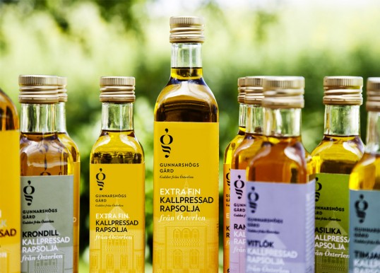
“When a farm known for its artisanal oil and food products has been family owned for 4 generations, heritage and tradition form the usual brief. But Gunnarshögs Gård came to us looking for more — an identity that not only conveyed their legacy, but also signalled the market leading expertise they had earned over generations.
With that challenge in mind, we sought to celebrate past success with a wholly modern expression. Marrying a graphic drawing of the actual Gunnarshögs farm with a persistent typeface and carefully chosen colour palette. Resulting in an identity that radiates appeal and tells a story of exquisitely modern products from a family company.”


“The distinctive G logo, inspired by how rap seed oil is cold pressed, anchors the new look bringing recognition and unity to the product range. Serving to also carry the Gunnarshögs mark of excellence into print material, signage and website.”