Designed by Uniform | Country: Norway
“Helios has since 1969 provided organic and environmentally friendly products to the Norwegian market. The products have traditionally been sold purely through specialty shops for organic products. Now the Helios brand is being launched to the people.
Uniform won the pitch to reposition the Helios eco-brand last year. The challenge was to transform the Helios brand from being a brand just for the typical eco-consumer, to become a brand for the regular retail customer.


Uniform has developed a new brand-positioning platform and redesigned the identity and packaging of over 100 varieties. The feedback from the supermarket chains has exceeded all expectations.
In the design process it was important to retain the historical foundation. Helios has a unique position and credibility in the eco segment with many loyal customers. The past few years, new players have entered the market, but not many producers have an equally strong history as Helios.


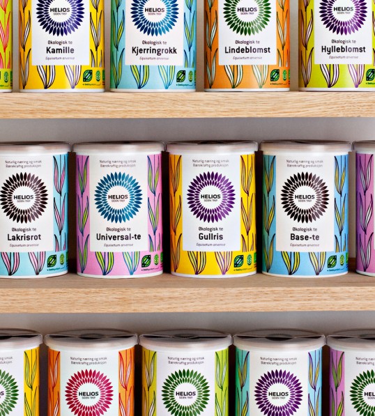
Through focus groups, it became clear that the name Helios had the highest recognition and was thus the most important item to keep. This gave the project freedom to rethink other aspects of the identity. Uniform redesigned the logo and gave it a prominent place on all packages in order to create a strong recognition in a chaotic grocery store. The logo underpins the importance of the name Helios – the sun god. As the packages will be placed next to well known brands it is important that Helios is evident in the shelves. With a strong and clear logo on all packages we created easy recognition across all product groups.


Different hand-drawn patterns were developed for all product lines. The patterns are based on the shape of a seed, giving associations to leaves and seeds, which supports Helios´ core values of care and naturalness. In addition fresh colors give the packages a modern look.


Common for all the products from Helios is the strong focus on ingredients and flavors. To underpin this, the ingredients will be visible in the packages where possible. Helios puts great efforts into high standards on the raw materials of their products. Together with their long history, this provides confidence and credibility with the customer. It was essential that this very focus and concern on quality was easily recognizable in the package designs.