Hilliard’s
April 26, 2012 | 8 Comments
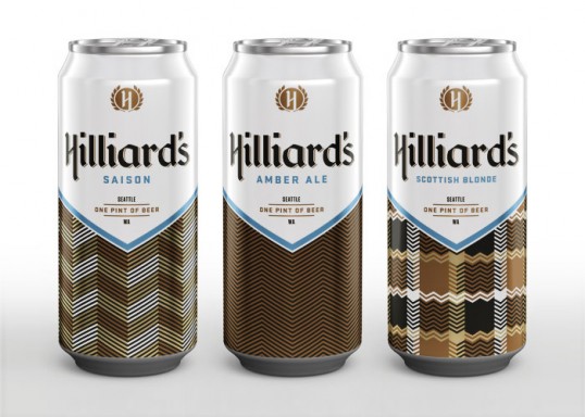
Designed by Mint Design | Country: United States
“A new artisanal brewery opening in the Seattleās Ballard neighborhood warranted a sleek contemporary twist on the vernacular of beer culture. A fresh application of a crisp herringbone pattern balances cleanly executed typography, channeling traditional European blackletter in a contemporary way.”
Comments
Warning: count(): Parameter must be an array or an object that implements Countable in /nfs/c02/h06/mnt/28959/domains/lovelypackage.com/html/wp-includes/class-wp-comment-query.php on line 399
8 Responses to “Hilliard’s”
Your Comment
April 26th, 2012 @ 11:22 pm
Brilliant packaging and type design
April 27th, 2012 @ 1:05 pm
I love the cans and the logo but the case kind of reminds me of a big cigarette carton? Doesn’t seem to take into consideration of the readability when stacked?
April 29th, 2012 @ 11:17 am
I want to buy this beer! Where can I get it?
April 30th, 2012 @ 4:05 pm
Beautiful and unique to the beer category. They showed great restraint while still remaining creative and clever
May 3rd, 2012 @ 4:19 pm
Really really nice! Great job.
May 8th, 2012 @ 12:50 pm
Wow. Fantastic!
August 29th, 2012 @ 9:44 pm
Overall, some very nice typography, colour palette is interesting, but for some reason it gives me a feeling of 1960’s American beer advertising, pushing the typical Bavarian beverage culture… in combination with 60’s department store sweater box. I like the idea, though it seems almost too clean.
November 21st, 2012 @ 9:18 am
Nice design and typography, but when looking at this, I keep thinking of some type of coffee drink instead of beer. It must be the browns.