Honey & Mackie’s
January 5, 2011 | 4 Comments
Designed by Wink | Country: United States
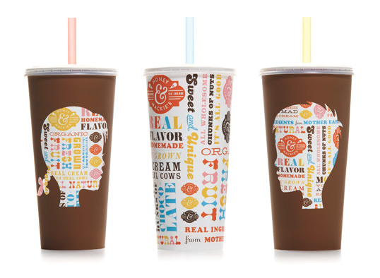
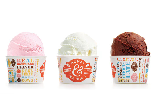
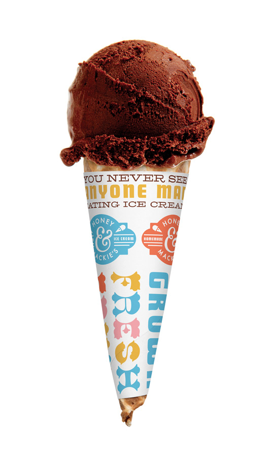
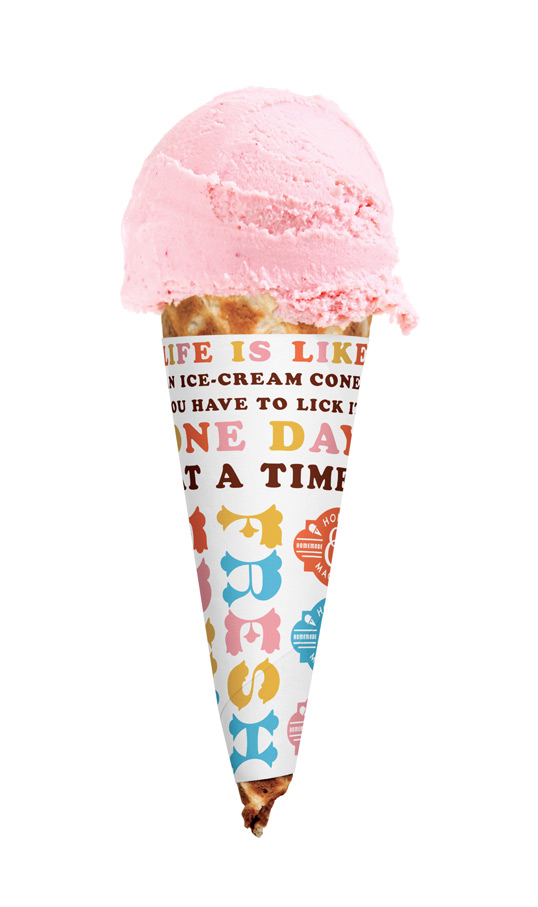
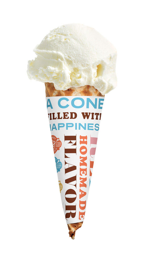
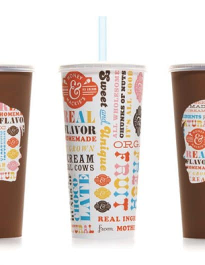
“Honey & Mackie’s is a ice cream shop for kids that caters to parents. The name of the establishment comes from the nicknames of the owners children. Thus, the branding & packaging needed to be modern, authentic & kid fun. In addition, the ingredients in their ice cream creations are all natural, organic and locally grown.”
Comments
Warning: count(): Parameter must be an array or an object that implements Countable in /nfs/c02/h06/mnt/28959/domains/lovelypackage.com/html/wp-includes/class-wp-comment-query.php on line 399
4 Responses to “Honey & Mackie’s”
Your Comment
January 6th, 2011 @ 2:38 pm
What a fun design! I really enjoy the playful use of typography and colors. I love the sophisticated use of typography as the main image. Great appeal to young children and the parents. Thanks for sharing!
January 10th, 2011 @ 8:13 am
great!! so fun and nice colours,so retro!;))
January 17th, 2011 @ 9:12 am
I pine for such a place – local, sustainable, delicious, beautiful, fun. Sigh. Absolutely dreamy!
January 18th, 2011 @ 4:34 am
is the paper around the cone really needed?
it’s more like useless paper that gets trashed as soon as you start eating…